At first I thought this was interesting, mainly because of all the design talent that is at Slack already. But then I realized, it was probably just an easier move to get an outside company to do it and make it a lot less political than had it been done in-house at Slack. And well, Pentagram is also huge, to be fair.
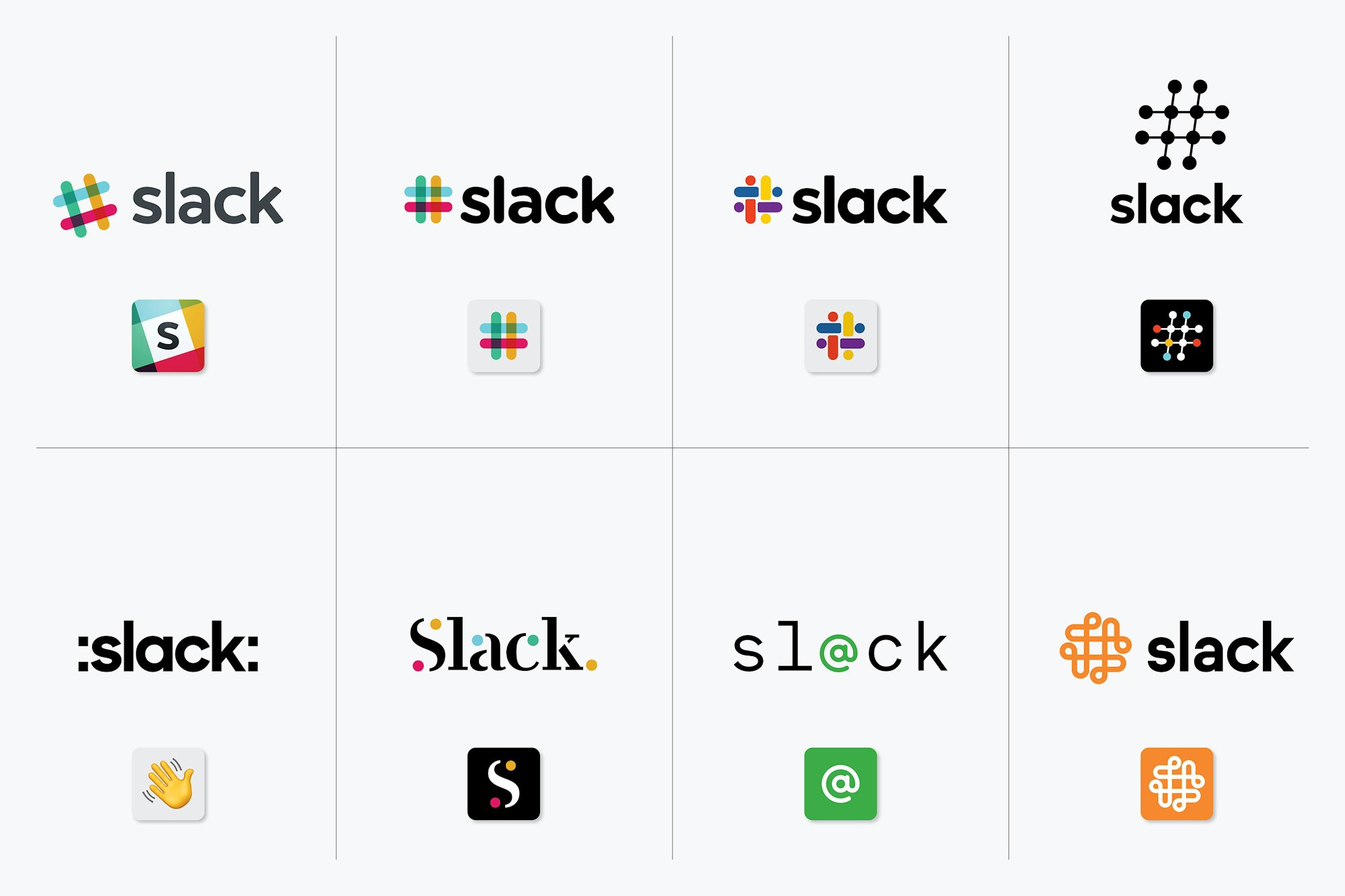
A lot of those “logo explorations for the octothorpe” look like swastikas to me, including the final shape. Basic shape I suppose, easy to find in most any circular-comprised-of-geometric-shapes kind of design, but still imagery you’d probably like to avoid associating with your brand.
Still, I love these kinds of process breakdowns. Having been involved in writing a few of my own, I know there’s probably a lot of pretentious nonsense to fill in the blanks (i.e. designers mess around a lot when working) but still it’s a nice read, short as it is.
I was playing around with the logo for my company, which features a configuration of overlapping boxes. A significant percentage of my brainstorming iterations ended up as swastika-esque shapes. Go figure.. Now I'm not a designer at all, just fiddling around, but those versions ended up in a not-to-be-opened folder immediately, because.. of course it shouldn't see the light of day! That's a bad association waiting to happen
But Pentagram didn't let that stop them, did they. Guess that's why they get paid the big bucks
A partner is involved in every Pentagram engagement though. Pentagram is not really like a huge Landor-esque firm, it's basically a series of small design consultancies each led by a partner that are loosely tied together. So anything that Pentagram is gonna do, at least one of the partners has to get behind it.
In some ways I guess that makes it very loosely like a VC fund.
Seconded. In these type of high visibility projects and prestigious consulting companies usually charge in hundreds of thousands and in millions for a single deliverable (narrative document, logo, brand). The whole process might months to a year with several people involved from the agency.
like...seriously? they really thought there was improvement to be made on the Library of Congress logo? Its a book...and its nice and iconic, recognizable. They said the new design gives a brand identity thats more "accessible"...what is not accessible about a book? I get that the library has more than books, but that doesn't really make the old logo any less relevant.
WHY change a logo which has served, embedded and part of the company's soul for over 40 years no less, especially if it was designed by someone like Vignelli.
Timeless design (Swiss typography, Braun industrial design, Muller-Brockmann's grid system, Ando's architecture) - they're timeless because they don't follow trends or try to catch up with current fads - they're built from fundamentals and aesthetic sensibilities that appeal universally.
They look "outdated" because everything else around it is following current trends. You cannot ever say the Coca Cola logo is outdated, nor can you ever say the LOC logo by C&G&H is outdated. If anything else, it is advantageous to be constant and "outdated" (there are exceptions such as Fashion brands).
Regarding flexibility - I agree. But, most companies understand the value of their decades old brand - see recent tweaks of the Lufthansa logo, American Express or MasterCard - they tweak them for future compatibility and digital media. They don't just throw it out the window without good reason. "Outdatedness" is not a good reason.
One is just colons added to the name and the wave emoji. The one beside it looks like it's from a 1997 tech company. The whole bottom row seems like it should be titled "We created these to show what not to do."
With these I always feel like they just made some shitty ones after the job was finished just for the ‘look we did a whole design and thought out of the box’ articles like these
More likely, they had a pile of shitty drafts that they cleaned up slightly for the same purpose. In a process like this, a pile of shitty drafts is pretty much a given. You're exploring a range of possibilities, and if you're too self-critical during brainstorming you might not sketch out the draft that becomes your best submittal.