like...seriously? they really thought there was improvement to be made on the Library of Congress logo? Its a book...and its nice and iconic, recognizable. They said the new design gives a brand identity thats more "accessible"...what is not accessible about a book? I get that the library has more than books, but that doesn't really make the old logo any less relevant.
WHY change a logo which has served, embedded and part of the company's soul for over 40 years no less, especially if it was designed by someone like Vignelli.
Timeless design (Swiss typography, Braun industrial design, Muller-Brockmann's grid system, Ando's architecture) - they're timeless because they don't follow trends or try to catch up with current fads - they're built from fundamentals and aesthetic sensibilities that appeal universally.
They look "outdated" because everything else around it is following current trends. You cannot ever say the Coca Cola logo is outdated, nor can you ever say the LOC logo by C&G&H is outdated. If anything else, it is advantageous to be constant and "outdated" (there are exceptions such as Fashion brands).
Regarding flexibility - I agree. But, most companies understand the value of their decades old brand - see recent tweaks of the Lufthansa logo, American Express or MasterCard - they tweak them for future compatibility and digital media. They don't just throw it out the window without good reason. "Outdatedness" is not a good reason.
The Mastercard rebrand is one of the most...masterful...logo refreshes I've seen! Kept what was iconic (you know some design firm wanted to update the "outdated colors") but gave it a touch of modernity.
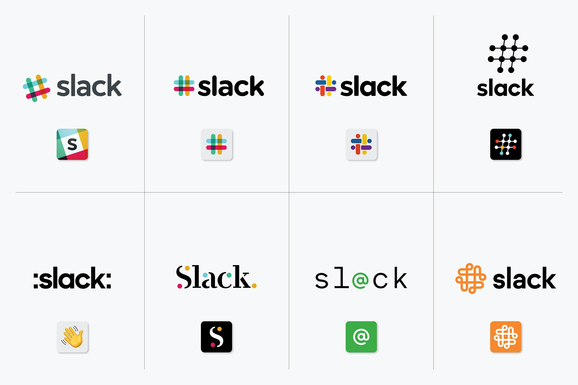
One is just colons added to the name and the wave emoji. The one beside it looks like it's from a 1997 tech company. The whole bottom row seems like it should be titled "We created these to show what not to do."
With these I always feel like they just made some shitty ones after the job was finished just for the ‘look we did a whole design and thought out of the box’ articles like these
More likely, they had a pile of shitty drafts that they cleaned up slightly for the same purpose. In a process like this, a pile of shitty drafts is pretty much a given. You're exploring a range of possibilities, and if you're too self-critical during brainstorming you might not sketch out the draft that becomes your best submittal.
It's like they recycled left overs from the EFF logo job.
Pentagram is hit or miss depending on who leads the project. Michael Beirut is one of the better partners and designers at Pentagram.