Hacker News new | ask | show | jobs
by giarc 2711 days ago
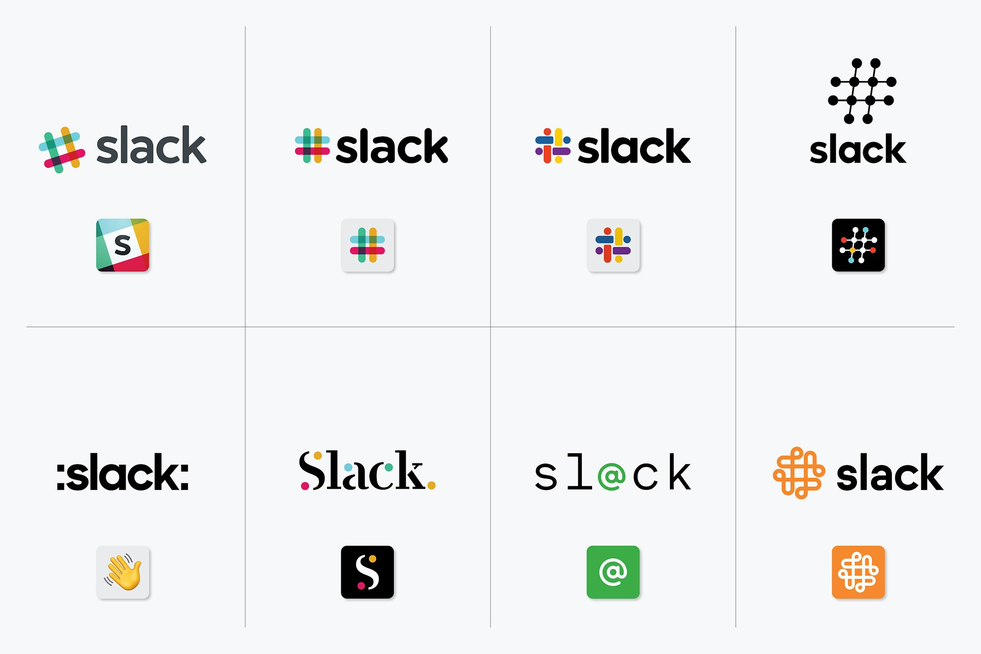
Yet at the same time, some of the logos in the Slack work are really bad.

https://pentagram-production.imgix.net/618d5092-a542-4dae-bd...

One is just colons added to the name and the wave emoji. The one beside it looks like it's from a 1997 tech company. The whole bottom row seems like it should be titled "We created these to show what not to do."

2 comments

Classic agency tactic, pitch two good ideas and eight bad ones... Client gets the illusion of choice and the agency gets creative control.
With these I always feel like they just made some shitty ones after the job was finished just for the ‘look we did a whole design and thought out of the box’ articles like these
More likely, they had a pile of shitty drafts that they cleaned up slightly for the same purpose. In a process like this, a pile of shitty drafts is pretty much a given. You're exploring a range of possibilities, and if you're too self-critical during brainstorming you might not sketch out the draft that becomes your best submittal.