While not everyone is a fan of this, I think it's the best article on web design i've read in a long time, and easily the best thing i've read on HN this year. Kudos.
Not all the advice is going to work in all situations, but they do serve as a great collection of simple but effective tips for improving the design. I've spent a long time tweaking things about in this realm, so these tips are welcome even if i already use many of them. Seeing them together also helps identify new techniques or combinations you can use.
I don't agree with tertiary buttons with no border and no underline, for example. I think that poorly communicates what's clickable/tappable and whats not. But then again, that's an easy tweak.
I have some gripes about using text colors close to the background color (http://contrastrebellion.com), but at least at the same time they're advocating not using grey.
I agree, this is the best design article I've read in maybe a decade.
UI Developer for over 20 years and fine arts and design major in college. From my experience I can't agree more with all of these recommendations.
Fewer font sizes and more font weights in general is always good.
Removing borders is extremely powerful for a lot of great reasons. When trying to maximize data density and readability, when trying to reduce clutter/visual noise and gain whitespace. The use cases for borders can often be resolved in other ways. However this puts more demand on the quality of the typography and layout hence the other techniques mentioned come into play those are design challenges worth addressing.
More on borders: This of course is a tool that can be mis-used but I find it is one of the best tools I have. The emphasis should be on data / information not on arbitrary borders. You can say the same thing many different ways visually. This is under-appreciated. You need not have font size, color, style all colluding to say the same thing, that you can accomplish with only one of these. When dealing with any series of items the human eye will clearly see periodic patterns and implied lines / alignments very quickly thus I find that often borders are unnecessary and even impede a working design.
A key observation is that with every border you have two white space areas to design with and a foreground element competing for attention with your actual information. Every border you eliminate gains you twice as much whitespace as you had and one fewer foreground element. 3 design components to 1. As with lines of unnecessary code, when you can delete elements in a design you are winning.
When it's about UI design, you know the advice is good when you see a lot of comments panning it on HN ;)
I just have two nitpicks: different font sizes are not a problem as long as the hierarchy is clear (i.e. sizes not seemingly chosen at random) and the advice on text contrast is accurate (unless you're using a display at very low brightness, pitch black text is jarring on light backgrounds), but the contrast on the example is too low. For body text, the ideal choice is closer to #222 or #333. Here, the advice on colors also applies: you can give the black a slight blue hue if the rest of the interface has blue accents.
The last example (https://cdn-images-1.medium.com/max/1600/1*cuYcwjOO26sKHImHa...) also moves me to give an unsolicited tip: pay attention to the "color" of the typeface you're using. That example has body text in Avenir (EDIT: looking again, it must be Proxima Nova); it's a thin geometric type, so the gray of the body text should be darker, or a bolder weight should be chosen. As it is, it's not very readable, which is okay for certain sentences but not appropriate for a warning message. Since system and webfonts are often constrained to regular and bold (and rarely, a bolder and a lighter weight) it's easier to control this by tweaking the gray.
An alternative is to give a higher priority to "you will lose all of your saved data".
#2.1: Reducing the opacity of your text makes it harder to read.
#4: Borders help logically separate areas of an interface. Throwing in more white-space is wasteful.
#4.3: Gratuitous white-space is wasteful, especially if you have limited screen real-estate (i.e., mobile).
#7 is a major pet-peeve of mine which I cannot agree with. If it's a button, make it look like a button. Nothing is more confusing than a button that just looks like some text label.
I have to disagree. In an absolute sense you are correct, however you're missing the relative benefit of each point.
#2.1: Yes, this would be an issue if overused, especially in paragraph lengths of text. However, inconsistent font sizes are worse.
#4: Why are you worried about white-space? If you have space, you can use it. If you run out, then you have to start rationing and using other visual tools. Borders have their place, but white-space should be preferred as the most neutral and inobtrusive strategy.
#4.3: So create a responsive layout for mobile that uses more borders where necessary.
#7: This is a major (and valid) criticism of flat UX, but slightly adjacent to the point in the article. The article says you don't need a background colour for every button, which is good advice.
I actually just got done running an A/B analytics test on a large website (>100k viewers/day). Statistics say you're right, least about the buttons. ;)
The client wanted a "button" without a background color because it looked bad to have two buttons side by side. My company told them that was a bad idea based on data, so we added tracking to their site and A/B tested their home page. Button with a background color had 40% more conversions than the "button" they wanted without the background color.
Several pieces of the advice given on that article are proven to be bad ideas for most websites if you track your users. What "feels" right and what is right are often two different things.
If you're ever making a change because you think it will perform better you better be tracking the statistics. Often times you'll find out you were wrong. Another, similar, example is that a client had a button they wanted to "draw attention to" so wanted to inverse the :hover background color with the normal background color so that it would stand out from other buttons. It looked different - but hurt engagement because it no longer looked like every other button on the site.
E:
This was meant to be a response to cpburns2009, the parent of the comment I responded to. Thanks to metalliqaz for pointing that out.
>The client wanted a "button" without a background color because it looked bad to have two buttons side by side. My company told them that was a bad idea based on data, so we added tracking to their site and A/B tested their home page. Button with a background color had 40% more conversions than the "button" they wanted without the background color.
Of course it did, it looked more like a button! But at what cost? It sounds like this button was not the primary action. So how many clicks were lost from the primary action - how much usability was lost from the page?
It was a primary button on the hero image in the standard "Header/Subheader/Call to Action" format. It was basically the only thing they wanted users to interact with.
>Of course it did, it looked more like a button!
And buttons without the look of a button are just called links. Links without visual distinction may as well be invisible. Like the infamous "black text link with no underline in the body of a paragraph of black text".
Designing is just like coding. You've got to be pragmatic about knowing when and where to use the tools in your belt.
You might have your little favourite programming trick, but a good programmer will know when and where to use it - you don't want to use a map function everywhere.
Note that the article's point about buttons isn't prescriptive and doesn't say "always do buttons like this". Instead, it talks about a common specific use case and talks about how you can improve the situation. It's up to you to take that information inboard and judge where to use it. It sounds like the specific example you cited was a good time to not follow this approach.
Yes, this was meant to be a response to cpburns2009, woops. Was in a rush and originally posted it as a parent level comment, deleted, then reposted under what I thought was the right thread. Looks like I still need more coffee.
> Yes, this would be an issue if overused, especially in paragraph lengths of text. However, inconsistent font sizes are worse.
I should have clarified this better. I dislike low contrast text because it makes it hard to read which is popular with the flat UI trends. Opacity isn't used so much from my experience, but light grey text on white is which has the same effect. I agree that inconsistent font sizes are bad too.
> Borders have their place, but white-space should be preferred as the most neutral and inobtrusive strategy.
In the example from the article I think the bordered version is much more concise and clearly delimits the search box and list. White-space seems to be used too carelessly in an attempt to avoid any clearly defined borders.
> The article says you don't need a background colour for every button, which is good advice.
You don't need to give every button a colorful background. But each button should have at least a border or background to distinguish it from standard text. The background can be just a boring grey like the classic Windows dialog buttons.
I disagree on #4. For me at least, a page with no borders and just whitespace looks like a jumble of elements. Not that everything should have a border, but plenty of websites could go for a couple more lines.
>#2.1: Reducing the opacity of your text makes it harder to read.
That's the point, to take away focus from something lower in the hierarchy.
>#4: Borders help logically separate areas of an interface. Throwing in more white-space is wasteful.
You're defining waste from a screen-space point of view, not a usability point of view. Who cares if the screen's pixels are at maximum utility, I want my user at maximum utility!
>#4.3: Gratuitous white-space is wasteful, especially if you have limited screen real-estate (i.e., mobile).
See above
>#7 is a major pet-peeve of mine which I cannot agree with. If it's a button, make it look like a button. Nothing is more confusing than a button that just looks like some text label.
That's the point, to take away focus from something lower in the hierarchy.
But there is a difference between merely moving something further down in your information hierarchy and making it hard to read. Low contrast text, like very small text, is hard to read for a large part of many markets. If it doesn't need to be read, why not go to the next stage and remove it entirely?
You're defining waste from a screen-space point of view, not a usability point of view.
There is precious little evidence that the trendy, overly spaced-out look of flat design and its derivatives has any usability advantage at all.
On the other hand, it is self-evident that if you're trying to show some sort of dashboard and spacing it out like that means you can only get 75% of your data onto a single screen instead of 100%, then your design is less practical.
There is also ample evidence that mystery meat navigation impairs usability, which is particularly relevant to the discussion of button styles here.
>But there is a difference between merely moving something further down in your information hierarchy and making it hard to read.
If you change "hard" to "harder", would you agree that there is no longer a difference? It seems you are just placing your bar for "too hard to read at all, in any context" somewhere different than the author of the article. The author is definitely making things lower in hierarchy harder to read on purpose, that's the whole point.
>There is precious little evidence that the trendy, overly spaced-out look of flat design and its derivatives has any usability advantage at all.
Honest question, is there any evidence that shows the usability is _worse_? How about evidence that reducing spacing or adding more options/data to a page _increases_ usability?
>if you're trying to show some sort of dashboard and spacing it out like that means you can only get 75% of your data onto a single screen instead of 100%, then your design is less practical.
A dashboard is a very specific design case. Most pages in general are more geared towards specific actions or specific "detail views" of data, where you have clear hierarchy of both data and actions. Aggregate data pages like dashboards are a whole different beast, and it seems weird to bring them up in a general UI design discussion. I would think dashboards are also more often internal than even a feature shown to real users. The days of dashboard-style pages like "web portals" are long gone.
> Honest question, is there any evidence that shows the usability is _worse_?
It is obvious that usability will suffer when you cannot fit all the required functions into the screen real estate. Now, since we're talking about websites, which usually have a rather low function density, that's not necessarily a problem. But try to apply this design advice to more complex web applications, or to professional software like Photoshop or Blender.
If you change "hard" to "harder", would you agree that there is no longer a difference?
No, I wouldn't. Of course variations in contrast or colour can be used up to a point without significantly affecting readability, and dogmatically taking any design guideline too far is usually not helpful. But when you really do get to the point of making things significantly harder to read, I think you've crossed into dangerous territory, with the usual caveats about readability depending on your expected audience.
Let's not muddy the issue with terms like "hard" vs. "harder". Let's look at the actual examples the author gave to illustrate the suggestion.
In the "Amsterdam walking tour" example, the light grey text is #737373 on #f7f7f7. That's already past the WCAG threshold at AAA level for normal (i.e., body size) text. It's used for legally significant material, while describing an activity that could easily be of interest to an older clientele.
In the later "Steve Schoger" example, the job title in the left pane is #929292 on #f7f7f7. That would be past the WCAG threshold even for large text and even at AA level. Maybe the job title isn't intended to be so important in that example, but again, if it doesn't need to be readable, why have it there at all?
The author is definitely making things lower in hierarchy harder to read on purpose, that's the whole point.
I understand that. I claim that doing so is measurably bad for usability in many situations, and that there is ample research to demonstrate this, upon which guidelines such as the WCAG's are based. The W3C pages about the guidelines provide extensive explanations of the reasons behind them, if you're interested.
Honest question, is there any evidence that shows the usability is _worse_?
In the sense of reduced data density, isn't it self-evident that some information is then harder to access?
A dashboard may be a somewhat specialised example, but the same argument applies to anything else with a lot of data to show: tables, lists, even the menu example in the article, where the more spaced out version has lost an entire menu entry off the bottom compared to the original.
A related argument also applies anywhere that space is at a premium, even if there is only a modest amount of data to present. That includes almost all UIs to be used on smartphones, and it includes many types of UI where you have different screen areas for different purposes and so the space within any given area can be quite limited.
In more specific cases, for example removing clear demarcation of search controls in favour of a generic background colour as also demonstrated in the article, there is plenty of research to show that the mystery meat approach to controls and navigation doesn't work well.
If someone is going to advocate for the fewer borders and more spacing approach, and if there are multiple well-established arguments for how doing so can harm usability in at least some cases, then I think the burden initially falls on the advocate to argue/demonstrate that their way doesn't fall into those traps.
You never mentioned WCAG guidelines before, you just said "making it hard to read." If you had said "the author doesn't respect WCAG guidelines, even lower-hierarchy text should meet WCAG guidelines," I think that would have been a very, very fair criticism.
This is "cheating at design" though, not "how to meet the full AAA WCAG thresholds."
I'm still not sure I really follow your line of thinking here. When the author says (paraphrasing) "make low priority text less readable, in order to highlight the important stuff comparatively," and you say "less readability is bad for usability," I think 'yeah... that's the point'. You take something that isn't as important and you make it less readable so that the important stuff is more readable by comparison. It helps users to differentiate between expected/primary data/actions and secondary/tertiary data/actions.
Do you just completely disagree with this philosophy? Do you think the author is mis-applying this, and you think some text that the author has made less readable is actually more important to users than the author thinks it is? Something else entirely?
Honestly I'm struggling to figure out where you actually disagree with the author, it seems to me you are both saying "lower contrast ==> less readability/usability." What am I still missing here?
Especially in contexts where there’s more then one hierarchy along more than one axis. UIs where you have content in the middle with multiple columns and sidebars and toolbars turns into a mess with the no borders flat design approach.
People tend to see it as a void that could be put to better use. We shouldn’t think of it as a void, though. We should think of it as a separator. It’s gestalt theory: objects that are close to each other appear connected. When you remove too much white space, groups of elements become less distinct, and cognitive load increases.
About #7, the article is not advocating making things not look like a button¹, it's advocating making secondary buttons lighter.
1 - In fact, the buttons there don't look like buttons. But that's because it uses a normal design, and nobody creates buttons that look like buttons anymore. Could we please standardize the "button look" with a small, fuzzy outset?
Well, the examples of tertiary buttons under #7 are plain text or plain text with an underline, and the article text specifically mentions styling tertiary actions like links as being "usually the best approach". It pretty much does exactly advocate making things not look like a button.
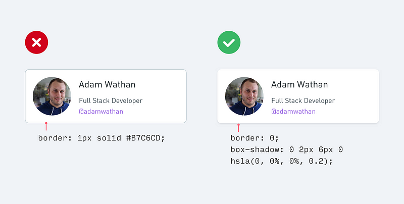
TBH I am starting to hate the subtle box-shadow on card components, including the example they provide as "better" [1]. It's getting to a point where it's hard to see the edges, especially if I have f.lux on or need to clean my glasses.
A regular border is easier to spot and more definite. It's not skeuomorphic but it's more functional.
Another concern is performance issues with box-shadow. A product I worked on displayed hundreds of twitter-like messages, each with its own box-shadow. Scrolling on less powerful devices would noticeably thrash. Disabling box-shadow improved it significantly. This was back in ~2012, so perhaps devices have become more powerful since then for this issue to be negligible.
This is still a major design consideration for developing world mobile apps with webviews and sites, removing box shadows tripled time-on-site immensely for a site I designed for a client.
Was this WPF by any chance? They really messed up on their drop shadow implementations, enough to cause a lot of performance problems that weren’t really necessary.
Is there a third alternative to separating card components? I don't really like using borders and box-shadow while aesthetically pleasing isn't as accessible or performative. I guess one could make liberal use of white space but then the component isn't really a card anymore.
The examples are mostly low contrast: a wasteland of white and preferably off-white empty space, also white and preferably off-white and preferably borderless boxes, lightly colored and mostly grey text inside them. When did combining dark text on a light background and light text on a dark background become nontrivial advice?
More readable, yes. But not as pretty. One can obviously go too pretty and lose all readability, but the socialization of the web has to some degree required we embrace more diversity in design.
I still have trouble not underlining clickable links, for example. But sometimes in a design it's just as obviously clickable without it, and less cluttered too.
I have the same issue. Not being a designer I can spend hours tweaking CSS color values, only to come back the next day and think it looks awful again. Two things have helped me: 1) using https://coolors.co/app and just trusting it, 2) creating SASS functions that derive secondary colors from a primary one. I currently don't have it at hand, but it boils down to making a series of lighter and darker versions of a given color, where, very importantly, the lighter ones are also less saturated than the shadows.
I'm in the same boat. I tend to use adobe color [1] to pick colors. You can give it a color, and it will give you complementary or contrasting colors. It is great for making background gradients or finding a color that "goes" with background for those of us that can't really tell.
Please don't use "lighter" and "darker" colors to signal importance. The contrast on these is invariably too low for most displays, and people miss that cue completely. What's lighter for you has the exact same color/intensity for most users. It's the same with "material design" where some genius decided that buttons no longer need to look like buttons, and links no longer need to look like links. Sure they don't. And users sure don't need to know what can be done with the interface. But what's the point? /rant
I like most of these, especially the different ways of making a hierarchy stand out. But I would say that if you're going to use gray text, pick out the exact shade using a really crappy LCD screen, maybe on an old phone, to make sure it's legible. Sites that use very light gray make me think the designer picked the color on a 5k iMac with the lights off.
There's also automated WCAG tools that check for "contrast errors". For example you should ensure you provide background colors as a fallback if the user has background images disabled or the image has not downloaded yet
I don't get why people are picking on this statement when most of the "good" examples given have plenty of contrast and he then goes into many techniques to maintain good contrast.
Ironically the contrast rebellion site uses very similar techniques to create visual hierarchy, see slide 2 in particular.
That's the point, they do not have plenty of contrast. In the very first "good example", the phrase "Explore popular tourist destinations..." is needlessly difficult to read for me, and "28 reviews" might as well not be there; it's difficult to notice and I need to strain my eyes to read something with that low contrast. That picture is a clear example of something that's hard to use for many people, doesn't satisfy official accessibility standards, and should not be recommended.
Maybe you're younger or have better vision or a significantly different screen than I do, but then let that be a warning that either you need do usability testing on some settings where that particular picture looks not sufficiently 'contrasty' to you as well, or you need to write down the RGB values that this image has with a note "that's not enough contrast for general usage even if it looks ok to my eye".
I would caution anyone from using these tips if you are building some kind of B2B Enterprise app where the focus is on getting as much information on screen as possible and minimizing the possibility of making errors.
Borders and clear destructive actions are a must. Needless spacing is wasted space.
On the contrary, well thought of white space guide the eye. It doesn't waste space. It is a part of the design in itself and is usually the hardest component to get right.
It can certainly waste space. And a lot of it. I’ve seen designers redesign tight tabular data layouts into light and airy cells of data and it ends up displaying 60% less information on a screen, requiring more scrolling from a user. This is exactly the kind of thing enterprise apps don’t need, but it looks good for a consumer app.
If it's important for you to fit as many rows in the screen as reasonably possible with maximum readability, then doing the separation with some separator takes less pixels/distance than separating them with whitespace.
There's not much to think about the whitespace in such a scenario - it's a simple yes/no experiment; you can try to simply remove the separating line. If the resulting whitespace ensures good enough readability/separation, then it works; if it'd need increased spacing, then it's worse than having the separator and not worth thinking about how much extra spacing you'd want - the answer to that is as little as possible, i.e., zero.
Not all empty space is "white space". Simply adding random paddings/margins around form fields isn't making good use of "white space". It's simply adding blank empty space. It's a dead weight on your page.
"White space" is negative space. It's something you should think of as an active part of the design.
One of the first rules of web design is "content is king". As a rule of thumb, any use of white space that makes your content harder to reach, read or see is a bad use of white space. It's breaking the "content is king" principle.
No part of your design should break the main web design principles. While there's no agreed upon list, "content in king" (or however you word it) is always present.
In short, yes, I agree.
---
Edit - A nice description of it:
"White space (negative space) is the area between design elements. It's another tool for designers to design for the user experience (UX). Remember that white space is not necessarily white; it’s just the name to indicate spaces where there are neither user interface (UI) elements nor specific content.
As a designer, you can introduce white space based on four main factors:
- Content,
- Design,
- user and
- brand
Use macro white space to organize content in the layout and direct the user through the blocks of content shown. Use micro white space inside the design element features as seen in the text, images and content blocks.
We can also approach white space as being passive or active. Passive white space does not have a specific role in the design other than facilitating the user experience. It is all about being easier to read. Active white space guides the focus and attention of users. It is more about standing out and making a statement."
https://www.interaction-design.org/literature/article/the-po...
My biggest pet hate is borders inside borders and text inside tight borders. This dark pattern is used on mandatory health warnings on cigarette packaging in my country (and many others) I don't think this was an accident...
In a more applicable example I removed most of the borders and heavy rules from a information dense page of a popular B2B site I worked on and the readability / scan-ability of the page increased dramatically and it had a very positive reception from out clients.
I do think one thing is missing from this guide and that is point lines or point rules. This is something I think I learned reading one or Edward Tuftes books. In print horizontal rules of 0.5 - 1 points (see: https://practicaltypography.com/rules-and-borders.html ), however on the web I find dark grey 1px bottom borders to have a similar effect.
The contrast examples in this article are a continuation in a poor trend of monkey see monkey do design that seems to come out of a reliance and reuse of original base bootstrap styles.
Designers seem to love to decide that certain text doesn't look right, is unimportant compared to that stock image they spent 3 hours selecting.
A great tip for cheating on design regarding typography is to completely drop "grey" from options.
What will happen is that during any manner of stress testing, usability or accessibility testing someone will immediately point out the lack of legibility.
More importantly when your site is audited for accessibility issues, you will fail on contrast every time.
I realize this was written as tips to help non designers but most "designers" should be staying away from making decisions about font color that lean towards "grey".
The cost and effort in development of most written copy far exceeds the value of this design trend that leads to low legibility, low impact type.
Web designers need to get back to the basics of typography. The web as a whole and "start up" style sites particularly suffer greatly from design choices by designers who clearly never actually read what they layout.
> More importantly when your site is audited for accessibility issues, you will fail on contrast every time.
I see this problem in the footer almost universally. High contrast footers have somehow become rare. I understand the desire to de-emphasize that section versus the primary content of a page, however if the footer is going to actually do its job I think it makes sense to have it set to a higher contrast design than not.
"4. Use fewer borders / 3. Add extra spacing". I'm not a big fan of this current trend. It seems that everyone is doing that and I found difficult to find the logical separation between elements.
Generally very good but mixing button/non-button style is a dark pattern that should be avoided.
If you have 3 alternative actions and one looks like a button, why don’t the other two? It is actually very easy to miss at least one option that way, or otherwise make a mistake.
a "dark pattern" is a UI tactic that is very purposefully crafted to deceive or manipulate a user. confusing button styles as you describe them are just "bad practice," they aren't dark patterns until designers use them with the specific intent of confusing the user
The one technical question I have is about using a lighter font to de-emphasise things: the example de-emphasises "*Prices may vary ..." underneath the bold, emphasised "$17 per person". Isn't that a bit of a "dark pattern"?
Overall I like this advice. However some of their examples do not really push the point. In the first example they make the text both bigger _and_ bolder and smaller _and lighter. This is good, however it is contrary to what they say.
In the shadows example, I prefer the bordered version. Shadows do not always look good and borders are "safer" to use.
These are great principles, but the execution still lies with you. I studied graphic design and have done it for many years, but I still fiddle for a while with the exact parameters: font size, font weight, text color, background color, border padding, border width, border color, border radius, text shadow. You can call all the "functions" he espouses, but whether it reigns on a throne of beauty, or falls apart in a pile of mush, depends on the "arguments" fed into those functions.
So if it doesn't look right at first, keep tweaking. Try a shade darker, try a shade lighter. Add more spacing, add less spacing. And so on. Expect to spend some time on it. Don't be discouraged if at worst it looks bad. Moving stuff around, and adjusting the different parameters, can eventually bring everything in a state that sings.
As a programmer who usually has to do all of the UI work himself, I definitely appreciate this! I've been on exactly one team during my career where we had a dedicated graphic design person. Alas, it's seen as a waste of money by most management types in my industry (govt contracting).
> 1. Use color and weight to create hierarchy instead of size
This article has a lot of great advice for the visuals. Using opacity to better mix colors is super handy.
But my main reaction is there is one bigger, better way to cheat at design in nearly all situations, and that's to avoid hierarchy. All the tips here can be taken as ways to cram more things together.
When I try harder to say one and only one thing in any page or dialog, my design has usually improved. It can be really very difficult to let go of some things I strongly feel the user needs to see, but when I do, it's surprising how often I find that "less is more".
> It can be really very difficult to let go of some things I strongly feel the user needs to see, but when I do, it's surprising how often I find that "less is more".
I find that when a screen has a lot of options, it usually means that the creator is un-opinionated / didn't make a decision on what's important and surrendered to implement everything that was asked, whereby it feels like a clown fiesta.
Please be sensitive to the lightness of greys you use for smaller text, especially if you value any of your users who are aging (all of them) or have vision-related issues (some of them, maybe more than you think)
This article strikes me as an indicator that we've reached peak this-kind-of-thing. In particular, I predict that in a year, it will seriously date your design if you're using a lot of CSS shadows and putting a random bright color on the side of anything square-shaped.
Is it just me or do the examples in the article look like they were copied from common websites? To me it is just a grab-bag of things I've seen before.
I think that's one problem with the web: so often are designs simply copied that the web looks boring. Well-designed, but boring.
Thank you for the share. Simple and useful tips to bring UI to a prettier state. Especially for a "pure" programmer, myself, who has no idea how to make nice interfaces without being guided.
Not all the advice is going to work in all situations, but they do serve as a great collection of simple but effective tips for improving the design. I've spent a long time tweaking things about in this realm, so these tips are welcome even if i already use many of them. Seeing them together also helps identify new techniques or combinations you can use.
I don't agree with tertiary buttons with no border and no underline, for example. I think that poorly communicates what's clickable/tappable and whats not. But then again, that's an easy tweak.