Hacker News new | ask | show | jobs
by fenwick67 3046 days ago
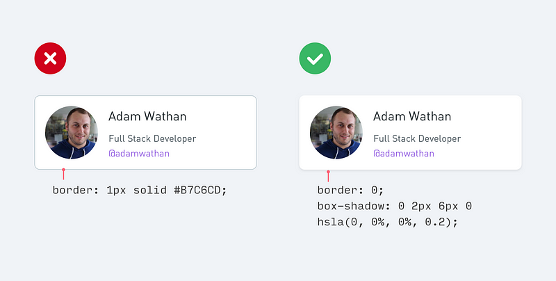
TBH I am starting to hate the subtle box-shadow on card components, including the example they provide as "better" [1]. It's getting to a point where it's hard to see the edges, especially if I have f.lux on or need to clean my glasses.

A regular border is easier to spot and more definite. It's not skeuomorphic but it's more functional.

[1] https://cdn-images-1.medium.com/max/800/1*qH-2RAS3rbnql-vpP8...

2 comments

Another concern is performance issues with box-shadow. A product I worked on displayed hundreds of twitter-like messages, each with its own box-shadow. Scrolling on less powerful devices would noticeably thrash. Disabling box-shadow improved it significantly. This was back in ~2012, so perhaps devices have become more powerful since then for this issue to be negligible.
This is still a major design consideration for developing world mobile apps with webviews and sites, removing box shadows tripled time-on-site immensely for a site I designed for a client.
Was this WPF by any chance? They really messed up on their drop shadow implementations, enough to cause a lot of performance problems that weren’t really necessary.
Is there a third alternative to separating card components? I don't really like using borders and box-shadow while aesthetically pleasing isn't as accessible or performative. I guess one could make liberal use of white space but then the component isn't really a card anymore.
A different background on the card versus its container