Oddly enough, the first thing that comes to mind when I see the new `Outlook` is: "all text is actionable."
Everything on that Outlook screen seems to be clickable, with the possible exception of the logo (upper left) and copyright notice (bottom left).
It reminds me of the `acme`[0] editor a bit; not nearly as flexible, of course, because it is executing pre-programmed commands, not arbitrary shell commands.
I bring `acme` up for two reasons: (a) it gives you an interesting perspective on "text as actions" and (b) look at that menu system... no buttons, no distinguishing marker, the menu is just text! The buttons are just text!
The editor itself is fairly nice to work in; a big departure, yes. Intuitive? Kind of; it only becomes intuitive once you understand "mouse-chording", after that the UI makes plenty of sense, even when it's almost entirely "flat."
--
So, if you assume everything is clickable by default (which is true, give or take a few very specific targets that have no obvious action anyways), why then does the user need skeuomorphic hints?
If 90% of the non-whitespace results in a "button press", that fact should become obvious fairly quickly, even to the uninitiated.
If you cut out all the cruft and only leave the functionality, the functionality will inherently "float" to the surface. And that seems to be the case in Microsoft's latest bout of UX.
Even if all text is clickable, not everything should have such a similar visual weight.
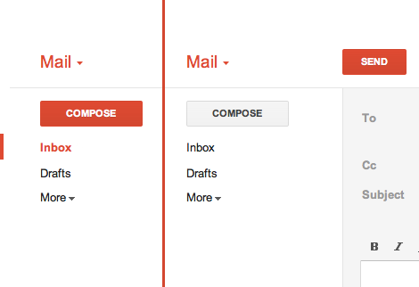
In Gmail, there's a big ass red button that does exactly what you think it will do. (http://25.media.tumblr.com/tumblr_lyrwjaXatd1qea4hso1_500.pn...) I bet I could use Gmail for the first time in Arabic if I had to. I'm not sure I could use Outlook.com.
And that big red button was only added much later. The first versions of gmail didn't have that.
MS is doing something very wise here. They are starting flat and then over time they will find a balance between what needs to be more obvious than other things. Just wait and see.
I should also point out that I only know what the "big red button" does because I use GMail.
If I was seeing GMail for the first time in a completely foreign language: I wouldn't associate "red" with Compose/New Message.
Colors carry significant cultural baggage.
Here in the U.S, for e.g: I associate Red with `danger`, `anger`, and perhaps `stop` or `caution.` [0]
At first glance, a red button (relying solely on skeuomorphic distinction, and not the text) is something I _definitely_ don't want to click. I would assume it would delete my selected mail, or perhaps mark it as spam.
At least with text you don't have that cultural baggage. You have the baggage of the language, e.g: you definitely have the steeper learning curve of learning the UI's language.
Though I'd rather it be grammatically ambiguous, as opposed to being visually ambiguous. For instance: if MS used slang or abbreviations in their Metro applications, it may throw off non-native speakers.
---
While I agree with GP that MS could benefit from using a bit more distinction. I'd still steer away from using colors and gradients and such (rather: such distinctions wouldn't be my first choice).
Cultural differences aside, you have to consider biological differences, such as color-blindness.
You can add visual distinction without necessarily resorting to skeuomorphism. For example: add some vertical lines, mess with font-weighting (which MS seems to use heavily), etc.
Once you play with metro for like 20 seconds, you understand how it works. My phone is WP7 and I absolutely love the interface. It is simple, fast, intuitive and most importantly...it get's out of your way. I can't stand all the chrome and bevels and transparent bobbles on Macs for instance.
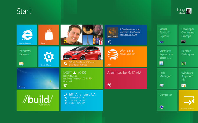
(Everything in that screenshot is a button. That's how Metro works)
I find your comment unfair and I am not even a MS user.
Usability is so much more about how it work, not just how it look.
All design systems will have some learning curve. A learning curve where you have to understand that everything a button is pretty close to being easy to learn.
So in my mind, the problem you seem to think there is is a pseudo problem. I.e. it's not actually a problem.
The difference is that glossy buttons have affordances that make them stand out from the rest of the interface. Which means that even after learning what is and isn't a button, you can find them more quickly. Completely flat interfaces lose this advantage, but they also have other benefits.
Links have more subtle affordances that make them stand out from web text and few people have a problem navigating that.
Microsoft's problem isn't inherent in having a 'flat' design. It arises because of their alternately uniform (outlook), and seemingly arbitrary (metro desktop), color, contrast, layout and font-weight choices.
They could conceivably shift to a design-language where those attributes could be used to hint at interactivity at least as well as a big shiny buttons.
I am not convinced that flat design implies no visual clues about function.
Granted, the visual clues from bevels, drop shadows and whatnot had the bonus of instant familiarity to people not accustomed to GUIs. Nevertheless this might have been a sort of a crutch and nowadays people even if they expect the computer to emulate their home appliances, the appliances themselves have less and less buttons and levers and more and more touchscreens or at least touch-buttons.
Everything on that Outlook screen seems to be clickable, with the possible exception of the logo (upper left) and copyright notice (bottom left).
It reminds me of the `acme`[0] editor a bit; not nearly as flexible, of course, because it is executing pre-programmed commands, not arbitrary shell commands.
I bring `acme` up for two reasons: (a) it gives you an interesting perspective on "text as actions" and (b) look at that menu system... no buttons, no distinguishing marker, the menu is just text! The buttons are just text!
The editor itself is fairly nice to work in; a big departure, yes. Intuitive? Kind of; it only becomes intuitive once you understand "mouse-chording", after that the UI makes plenty of sense, even when it's almost entirely "flat."
--
So, if you assume everything is clickable by default (which is true, give or take a few very specific targets that have no obvious action anyways), why then does the user need skeuomorphic hints?
If 90% of the non-whitespace results in a "button press", that fact should become obvious fairly quickly, even to the uninitiated.
If you cut out all the cruft and only leave the functionality, the functionality will inherently "float" to the surface. And that seems to be the case in Microsoft's latest bout of UX.
[0]: http://acme.cat-v.org/readme