Hacker News new | ask | show | jobs
by nostromo 5019 days ago
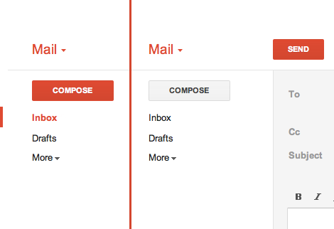
Even if all text is clickable, not everything should have such a similar visual weight.

In Gmail, there's a big ass red button that does exactly what you think it will do. (http://25.media.tumblr.com/tumblr_lyrwjaXatd1qea4hso1_500.pn...) I bet I could use Gmail for the first time in Arabic if I had to. I'm not sure I could use Outlook.com.

1 comments

And that big red button was only added much later. The first versions of gmail didn't have that.

MS is doing something very wise here. They are starting flat and then over time they will find a balance between what needs to be more obvious than other things. Just wait and see.

I should also point out that I only know what the "big red button" does because I use GMail.

If I was seeing GMail for the first time in a completely foreign language: I wouldn't associate "red" with Compose/New Message.

Colors carry significant cultural baggage.

Here in the U.S, for e.g: I associate Red with `danger`, `anger`, and perhaps `stop` or `caution.` [0]

At first glance, a red button (relying solely on skeuomorphic distinction, and not the text) is something I _definitely_ don't want to click. I would assume it would delete my selected mail, or perhaps mark it as spam.

At least with text you don't have that cultural baggage. You have the baggage of the language, e.g: you definitely have the steeper learning curve of learning the UI's language.

Though I'd rather it be grammatically ambiguous, as opposed to being visually ambiguous. For instance: if MS used slang or abbreviations in their Metro applications, it may throw off non-native speakers.

---

While I agree with GP that MS could benefit from using a bit more distinction. I'd still steer away from using colors and gradients and such (rather: such distinctions wouldn't be my first choice). Cultural differences aside, you have to consider biological differences, such as color-blindness.

You can add visual distinction without necessarily resorting to skeuomorphism. For example: add some vertical lines, mess with font-weighting (which MS seems to use heavily), etc.

[0]: http://www.informationisbeautiful.net/visualizations/colours...

I agree completely.