|
|
|
|
|
|
by azinman2
4502 days ago
|
|
|
You had the same gut reaction as me but if you look at the beginning before he started using it there was a legend of how many fingers map to each icon (no room for text as well?). Beyond spatial memory what's good about this is that you don't have to look anywhere while still adjusting (some speech feedback about what mode you've selected would be good). The lack of sight is the most compelling aspect -- but I can guarantee you my parents would likely never remember the mappings and always have to look at the legend. Even then they'll probably be confused. |
|
|
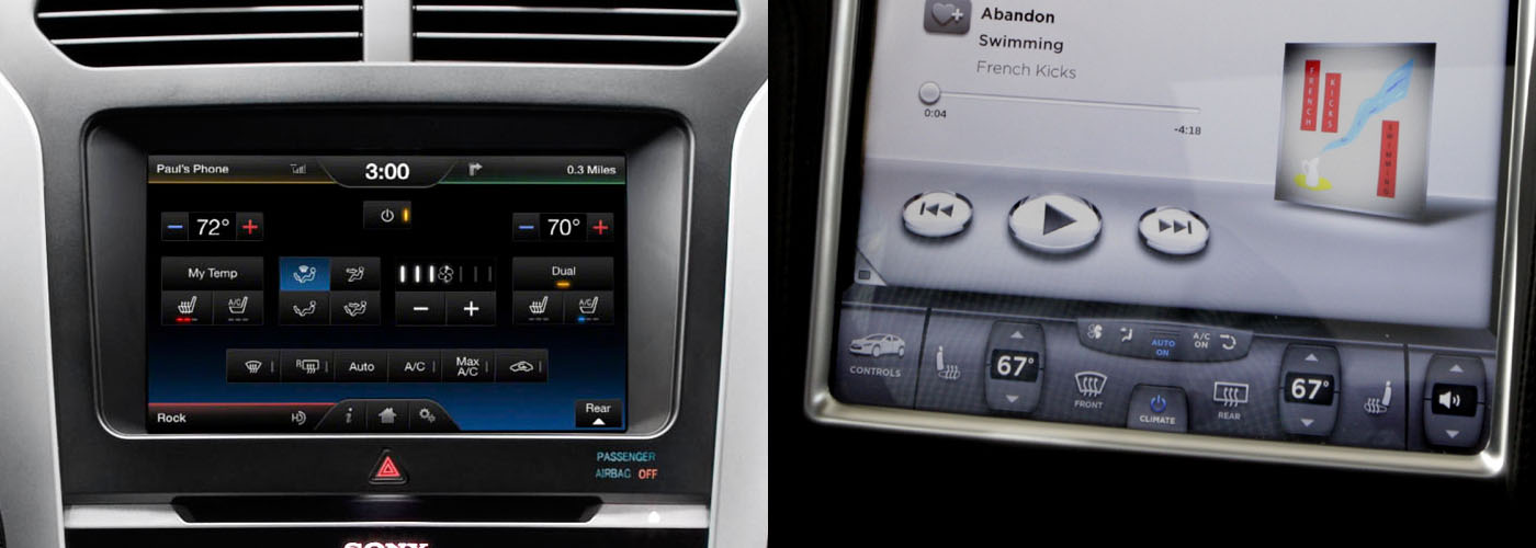
Look at a traditional dashboard. The air conditioning knob is a different shape and size from the stereo's volume knob, and located in a different place (ideally). Those things make it easy for the the driver to distinguish one from the other, and find them while keeping their eyes on the road.
There are other cues that usually exist to help as well, such as a blue-to-red graphic around the temperature control, the volume control being next to other audio features like the radio display, etc.
In an environment where the user has to keep a 3,500 lb steel machine safely controlled while traveling 100 feet per second, the rules of usability become incredibly important.