Hacker News new | ask | show | jobs
by m132 45 days ago
I still have Sonoma on some of my devices. All I can say is: wow, steady regress.

The save dialog, albeit a little shakey, is nowhere as chaotic as in your example. The buttons in Notes move between panes in a perfect seamless manner. Albeit the animation occasionally glitches out when you repeatedly focus and deselect the Safari bar, the cursor is perfectly timed with the text, only fading in after the text is done moving to the left. The Preview bug must be something recent too, I can't reproduce this.

https://streamable.com/kx7op6

I miss it when companies like Apple, Sony, and IBM paid attention to the smallest details. Apple in particular earned its current valuation with the iPhone, an all-touch device that did nothing extraordinary compared to Windows Mobile and Symbian PDAs of the time (and was in fact functionally lagging behind compared, failing to even match the then-contemporary feature phones in some areas) BUT one that you didn't actually want to smash against a wall after a few minutes of use. Now these animations are bringing back exactly the Windows Mobile and Symbian vibes.

Remember how happy Steve used to be with OS X animations? He would replay them on stage multiple times, in slow motion. These though, these would have the people behind them face the fate of the iPhone 4 antenna man.

2 comments

The animations in your short video do in fact look more orderly and less chaotic. Could it be that Apple was using AppKit in Sonoma and switched to SwiftUI now?
A lot of these animation regressions in Apple's UI originated from iOS 7 and the move away from skeuomorphism.

The move away from skeuomorphism made it acceptable for UI elements to do things that make no sense.

Examples:

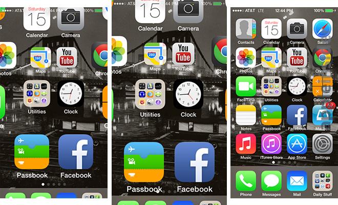
1. https://photos5.appleinsider.com/archive/13.06.15-Homescreen...

The status bar is unreadable on in-between frames, whereas in iOS 6 there was no such problem.

2. https://youtu.be/XawiZc8qmWA?si=vqT-JEYf0NDp8I9o&t=461

Play it at 0.25x and notice the app opening animation.

In iOS 6, the status bar is never unreadable for a single frame.

In iOS 7, the status bar is first obstructed by home screen icons animating under it, then obstructed by the dock animating over it, and finally it fades away while a new status bar is drawn on the app that is being opened.

It irks me to no end that iOS handles the status bar this way to this day. In the app switcher, every app card is drawn with a blank area at the top [1] where the status bar would go, when really the status bar should be permanently at the top and the app card should not include space for the status bar (webOS figured it out before iOS 7 [2]).

1. https://imgur.com/a/Qj6DGus

2. https://imgur.com/a/bM8OWZc