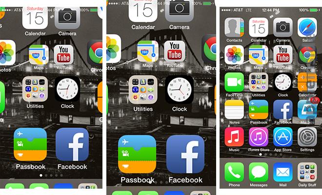
| A lot of these animation regressions in Apple's UI originated from iOS 7 and the move away from skeuomorphism. The move away from skeuomorphism made it acceptable for UI elements to do things that make no sense. Examples: 1. https://photos5.appleinsider.com/archive/13.06.15-Homescreen... The status bar is unreadable on in-between frames, whereas in iOS 6 there was no such problem. 2. https://youtu.be/XawiZc8qmWA?si=vqT-JEYf0NDp8I9o&t=461 Play it at 0.25x and notice the app opening animation. In iOS 6, the status bar is never unreadable for a single frame. In iOS 7, the status bar is first obstructed by home screen icons animating under it, then obstructed by the dock animating over it, and finally it fades away while a new status bar is drawn on the app that is being opened. It irks me to no end that iOS handles the status bar this way to this day. In the app switcher, every app card is drawn with a blank area at the top [1] where the status bar would go, when really the status bar should be permanently at the top and the app card should not include space for the status bar (webOS figured it out before iOS 7 [2]). 1. https://imgur.com/a/Qj6DGus 2. https://imgur.com/a/bM8OWZc |