|
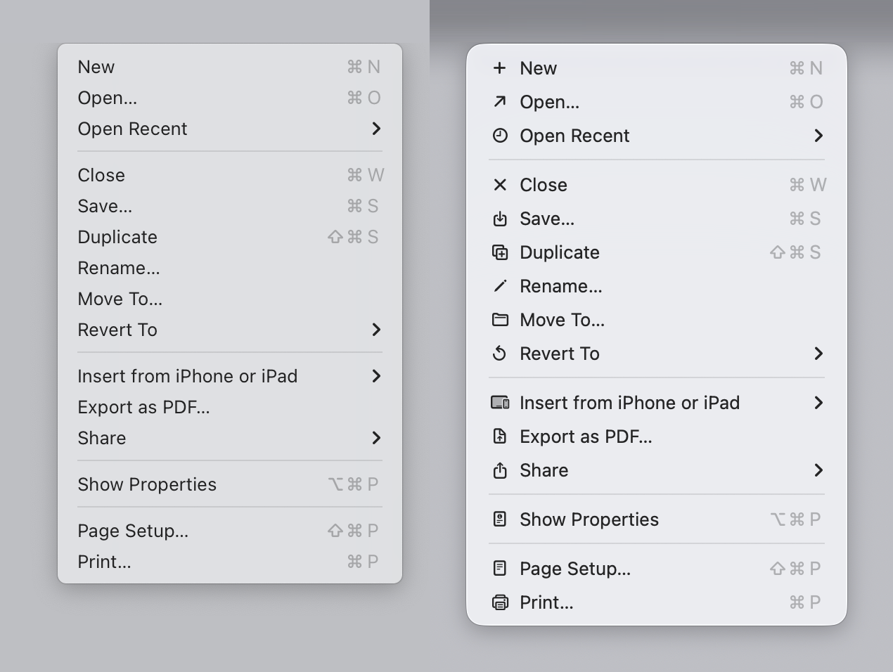
Interesting. The article starts with this: > Sequoia → Tahoe It’s bad And I look at the image... And I like it? I agree with the author that it could be better, but most of the icons (new, open recent, close, save, duplicate, print, share etc), do make it easier, faster and more pleasant for my brain to parse the menu vs no icons. Again, I don't disagree that you could do it better, I just disagree with the premise that the 1992 manual is "the authority". Display density has increased dramatically; people use their computers more and have been accustomed to those interfaces, which makes the relationship of the people with the interfaces different. Quoting a 1992 guideline on interfaces in 2026 feels like quoting the greeks on philosophy while ignoring our understandings of the world since then. |