|
|
|
|
|
|
by jaffa2
166 days ago
|
|
|
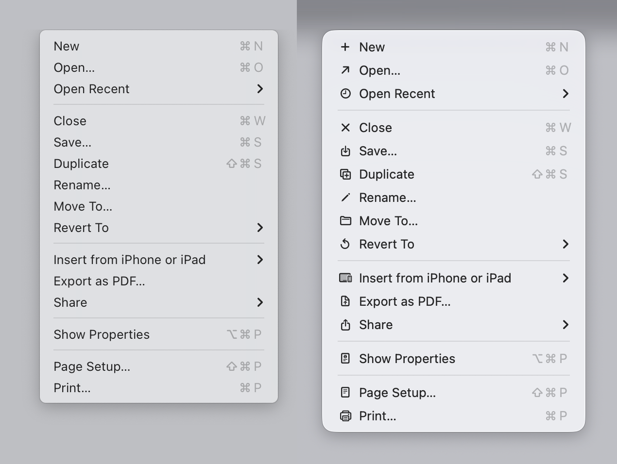
most of your points are refuted in the article. but I'll pick this one : "Display density has increased dramatically" Yes, it has, and Tahoe does not take advantage of this, infact the icons are smaller, and harder to read, using fewer pixels than windows icons of 25 years ago. |
|
|
Sure, we can debate about the general points.
Yet, we can't refute that my subjective opinion evaluation of the opening image looks better (for me) , reads better (for me) and is easier (for me) to parse. Either I don't fit the general guidelines, or the general guidelines need a revision, that's my point overall.