|
|
|
|
|
|
by NoGravitas
1525 days ago
|
|
|
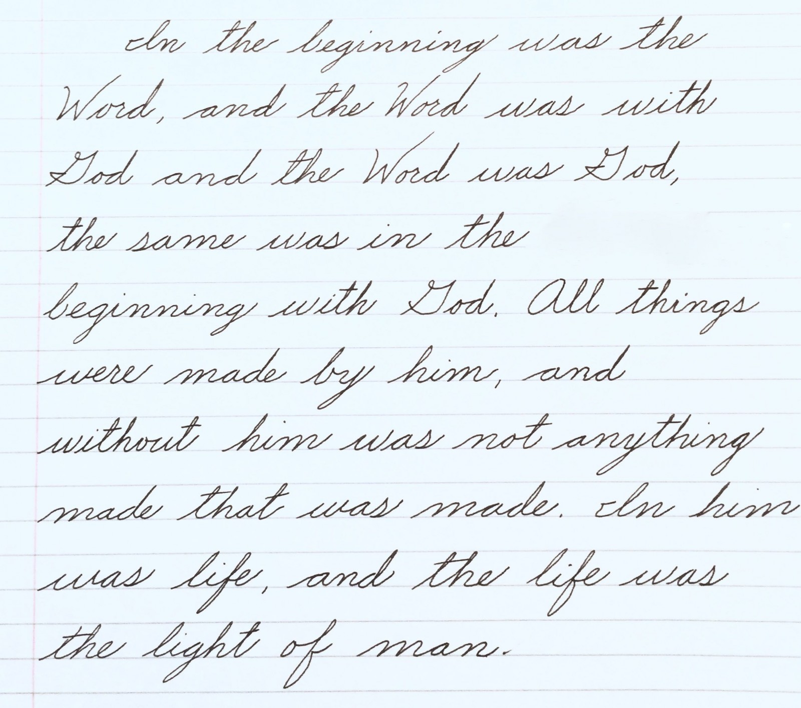
> In penmanship class, we learned a standard cursive font. I think it’s the standard cursive font, in fact. He's wrong that there's a standard cursive. Different countries and different centuries have used a variety of different cursives. Most Americans who were taught cursive in school learned either Zaner-Bloser or D'Nealian, which both derive from Palmer. Both of them are terrible. They have indistinct letter shapes that degrade horribly when written quickly. Cursive Italic handwriting is much more legible, if slightly slower. There are popular systems including Getty-Dubay Italic and Barchowsky Fluent Handwriting. Both of those are fine, and should be strongly preferred to 19th-20th century cursive. |
|
|
(Russian cursive is also notoriously hard to read for non-native speakers owing to a few idiosyncrasies: some letters are entirely different written vs. in print, and the letter forms can lead to ambiguity -- certain letter combinations are effectively identical.)
A near-universal phenomenon among people I've spoken with who took Russian in college is the unconscious blending of the two letter sets. Students, myself included, would routinely find themselves using Russian letters in English script while writing without realizing it, and sometimes even reading it later without realizing the presence of Russian letters.
I knew it was happening to me, but it wasn't until I loaned my political science notes -- ostensibly in English! -- to a non-Russian-student pal that the prevalence of the swaps were really clear. "Uh, I absolutely cannot read this."
Ooops.
Anyway, it's tangential to this topic, but I thought it was interesting enough to share.
This is the first link I found with illustrations of the Russian cursive alphabet:
https://golearnrussian.com/russian-cursive/