Thanks for your feedback -- definitely want to make sure our landing page explains Ditto clearly. Any specific suggestions for what to improve on or what's confusing?
I understood what the problem your product was solving from the title of this Launch HN thread, but viewing the landing page, I think there's big room for improvement for how you explain that.
I think a few things would help:
- Revise your copy to speak more plainly. You're addressing folks working on many different parts of the product, but the language comes off as jargon. As a starting point, I think the title of this thread is way clearer
"Keep product text in sync from design to production" -- Makes sense
"manage and componentize the words across their product from design to production." -- I have no idea what that means
- Replace all of the screenshots and graphics. I see this done a lot, where screenshots are shown and the reader is supposed to understand what's happening, but is not often effective, because they don't understand the context for the screenshots, and it's not clear what part of the screenshot they should be focusing on. I would suggest you provide a very simple clear animation that demonstrates the "magic" behind your application. If it's syncing copy across many different tools and stages of the product, show that magic happening. In other words, if a reader saw nothing but this graphic/animation would they understand what your product is offering them? The demo video is not what I'm referring to, although it is helpful and should remain on the page, maybe even move it up a bit.
Super useful, thanks for the advice. It's definitely been a challenge to figure out the right language/vocabulary to describe what we're working on, especially since what we're solving for isn't talked about.
A clearer graphic that demonstrates the "magic" is also a great suggestion!
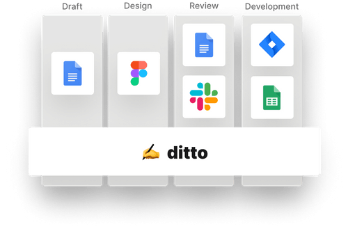
I feel that is not entirely clear how you enable this workflow that keeps all this text dependencies at sync. The collaborative part makes sense. But what's more important about this tool is explained with a somewhat vague graphic (https://uploads-ssl.webflow.com/5fb84e8c68f67b29553103fa/604...)
I think it would be more useful to see an explanation that showcases how this text components sync across all tools and how that allows you to always have a single source of truth for your text.
I think another valuable thing to showcase is to showcase the features of this solution by persona. What do you get from this as a writer, designer, PM, developer... That's extremely important IMO. If you don't do this, it's pretty hard to relate to this problem and solution.
Verbalizing the problem in the communication is particularly important. I know this is a problem many cross-functional team have but it's a very discrete problem. It's easy to familiarize and relate to this problem if you explain it.
"Forget about outdated text in your product and the painful and lengthy process to update it.
Ditto is a platform that allows you to write and collaborate on your product text while keeping everything in sync.
From design mocks in Figma to your text strings in your production code, with Ditto everyone gets the same product text seamlessly."
Really appreciate these suggestions -- thanks! Excited to make some updates to our landing page based on the feedback we've received here.
Agreed that we should explain how Ditto syncs text across the stages of product development better, especially since that's the big vision (end-to-end text management).
We do have persona-specific pages for writers, designers, and developers (you can find those in the Product dropdown in the top nav, in the section near the bottom of the page, or in the footer). On these pages, we try to verbalize the specific problems those segments are facing, and then specifically how Ditto solves them.
I understood what the problem your product was solving from the title of this Launch HN thread, but viewing the landing page, I think there's big room for improvement for how you explain that.
I think a few things would help:
- Revise your copy to speak more plainly. You're addressing folks working on many different parts of the product, but the language comes off as jargon. As a starting point, I think the title of this thread is way clearer
"Keep product text in sync from design to production" -- Makes sense
"manage and componentize the words across their product from design to production." -- I have no idea what that means
- Replace all of the screenshots and graphics. I see this done a lot, where screenshots are shown and the reader is supposed to understand what's happening, but is not often effective, because they don't understand the context for the screenshots, and it's not clear what part of the screenshot they should be focusing on. I would suggest you provide a very simple clear animation that demonstrates the "magic" behind your application. If it's syncing copy across many different tools and stages of the product, show that magic happening. In other words, if a reader saw nothing but this graphic/animation would they understand what your product is offering them? The demo video is not what I'm referring to, although it is helpful and should remain on the page, maybe even move it up a bit.