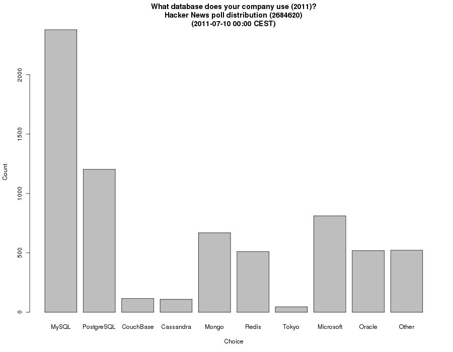
... and one of the 2010 poll: http://koldfront.dk/misc/hn/database2010/data.png
(Updated every ~4 hours currently; I will be fading out the update rate.)
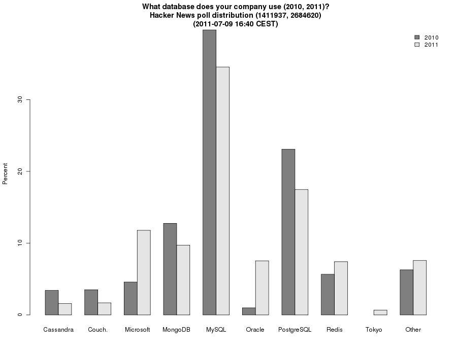
The two sets of data ought to be shown in the same graph, really.
Edit: I have now joined the two years in one graph, and plot the percentages to make it easy to see the change: http://koldfront.dk/misc/hn/database/data.png
On a lighter note, does this support the theory of HNers who complain that HN is not the same any more and it has been generalized?