|
|
|
|
|
|
by asjo
5473 days ago
|
|
|
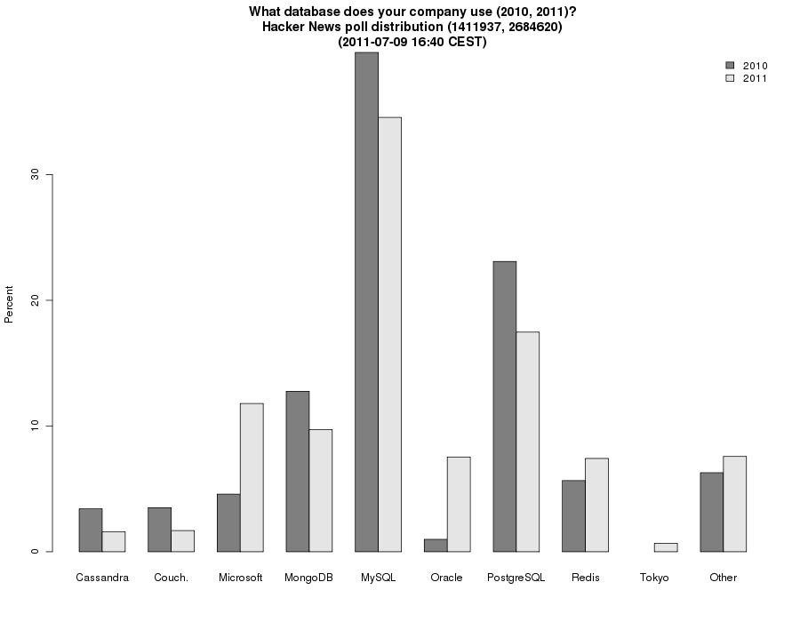
They reflect the polls, so they also tell you that the polls didn't have the same choices. The two sets of data ought to be shown in the same graph, really. Edit: I have now joined the two years in one graph, and plot the percentages to make it easy to see the change: http://koldfront.dk/misc/hn/database/data.png |
|
|