|
|
|
|
|
|
by resu_nimda
2122 days ago
|
|
|
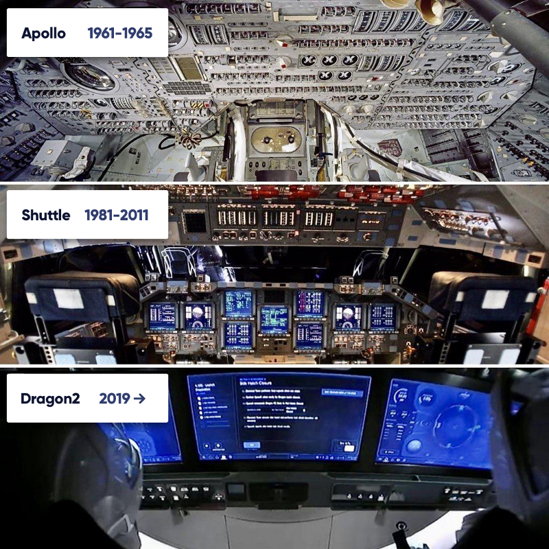
It really depends on the context and the use cases. The F-15 cockpit is an extreme example of a very complex interface that needs to be highly performant under intense life-or-death conditions. Most UIs that people design, including this library, are not meant for anything remotely similar to those situations. A lot of times it's mostly for consuming content. That video of the F-15 actually features a lot of overlay UI elements that are very similar to this project's sci-fi style. Did you lament that, or wonder if that functional uselessness was influencing the designers of the airplane? Or did it make for a better viewing experience than barebones labels with no animations? I can't speak to the SpaceX cockpit and how well it performs the job it was intended to, do you know of any testimony from people who have used it? I have to believe that they would put function over form for something like that, but that doesn't mean that form has no place either, they are definitely aiming for the lofty goal of achieving both. |
|
|
You would think that, but that isn't necessarily the case. I worked for a Naval intelligence contractor back in 2007, and I was surprised at the amount of times there were requests at the top to "make it look cooler". War rooms at the time tended to look exactly like the Hollywood depictions. Not because Hollywood got it right, but because generals saw the movies and said, "I want one that looks like that". Even in the most functional of situations, flashy looks sell hearts.