It's not a matter of objecting to the picture. I don't at all. But when you are linking to something that is not safe for work, you are supposed to warn people as common courtesy. Also, I find your tone patronizing and unusual for this community.
Looks like they are getting a good response and more mindshare then they should for a logo. Perhaps this will be the new "new coke/old coke" case study of the future but "now with more crowdsourcing (tm)".
I was thinking the same thing. GAP put out a crappy new logo on purpose (They aren't using it anywhere) knowing it would create buzz. Roll that buzz into a crowdsource contest. And in the end stick with your orig logo.
Anyone know what the business case for this change was? What was wrong with the old logo? I'm having a hard time understanding what the thinking was here.
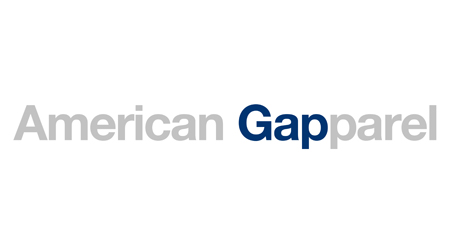
Main purpose must be repositioning of the brand - their largest competition is American Apparel. Place the new logo between the old gap logo and the AA logo, the thread linking all three will be pretty obvious.
Wouldn't surprise me if a buy out was on the cards.
Looking at the old logo, I'd say it looks like it's aimed at a fifty-something demographic -- I don't blame them for wanting something that looks "younger".
But the new logo is a mess, and looks like something you'd come up with in Powerpoint in five seconds without changing the defaults. There's nothing wrong ideas-wise with san-serif "gap" over shaded blue square, but it comes out looking bad.