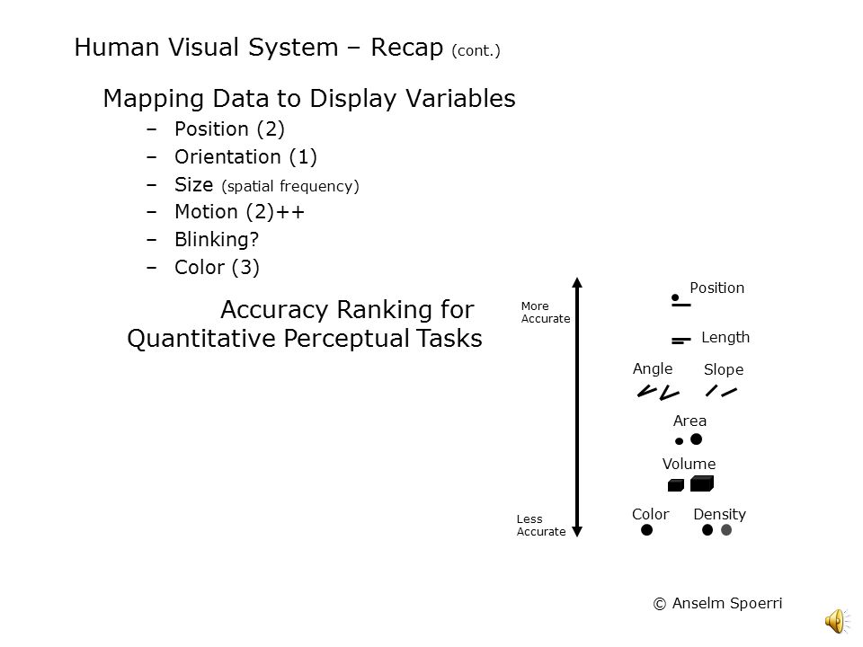
Hacker News new | ask | show | jobs
by mykeliu 3215 days ago
Good God that pie chart.

edit: Should've probably elaborated. Not only is a pie chart usually ineffective at conveying information, but these percentages are totally arbitrary. There's not really a specific explanation for why linear algebra is weighted more than multivariate calculus and algorithms & complexity combined, not to mention the fact that linear algebra and multivariate calculus in machine learning overlap to a large degree, and they both feed into algorithms & complexity as well.

And then on top of that, the 3D and shading seem totally unnecessary, but that's just me.

5 comments

I agree. The degree to which that pie chart is both hideous (we can do much better in 2003, oh wait, 2017) and uninformative+dishonest makes me not want to trust IBM with understanding any of my data (which is what machine learning is all about).

Heck, the fact that the humans at IBM can't classify it as dated makes me suspicious of their ability to make a machine classify anything.

IBM has been making a lot of marketing efforts around trying to own 'big data' and machine learning. Depending on who you ask (typically people entrenched in the dying mainframe space), IBM already is the predominant choice in cloud. If they're going to rely on marketing exclusively, they should at least shell out for pretty graphics.

I'm not sure why you're criticizing that 3D pie chart -- big companies pay lots of money to consultants from IBM to get a chart that good.
Surely there's a Chart.ly (or alternatively 314Chart.io) that is in the works somewhere - disrupting this market using tensor flow deep learning networks to produce the best pie charts possible.
It's still early stages. I'd recommend a multivariate test on the best pie chart colours, following Google's astounding results from their search link colour test.
You're right; perhaps my envy got the best of me.
I stopped reading when I saw that chart and came here to comment. Lo and behold what is the top comment..

It could have been worse though. It could have been a 3D donut chart.

Btw there are well studied reasons for why this particular chart is a terribly bad idea for displaying quantitative information [1].

[1] http://slideplayer.com/slide/5143061/16/images/9/Human+Visua...

Absolutely agree. This weighting is pointless considering the interdependent nature of the items being weighted.
You might enjoy /r/dataisugly.