|
|
|
|
|
|
by laichzeit0
3215 days ago
|
|
|
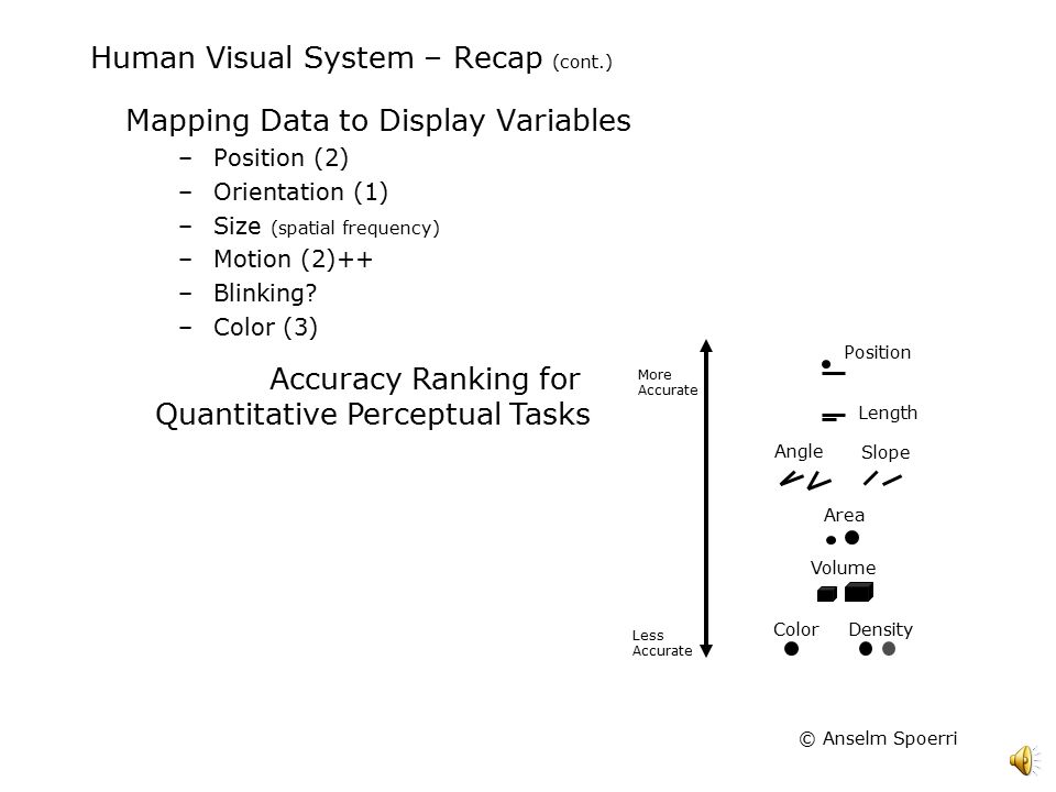
I stopped reading when I saw that chart and came here to comment. Lo and behold what is the top comment.. It could have been worse though. It could have been a 3D donut chart. Btw there are well studied reasons for why this particular chart is a terribly bad idea for displaying quantitative information [1]. [1] http://slideplayer.com/slide/5143061/16/images/9/Human+Visua... |
|
|