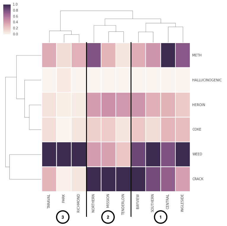
The colors are to normalize the different districts. The darkest color is always the most prevalent drug in that precinct, and the other colors in that column are relative to that drug.
The brackets are presumably an explanation of how the "clustering" was done, though with such a small data set it could have been done manually.
The brackets are presumably an explanation of how the "clustering" was done, though with such a small data set it could have been done manually.