|
|
|
|
|
|
by Livven
4183 days ago
|
|
|
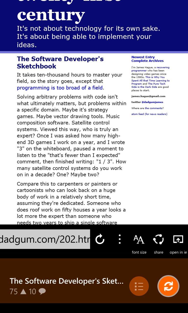
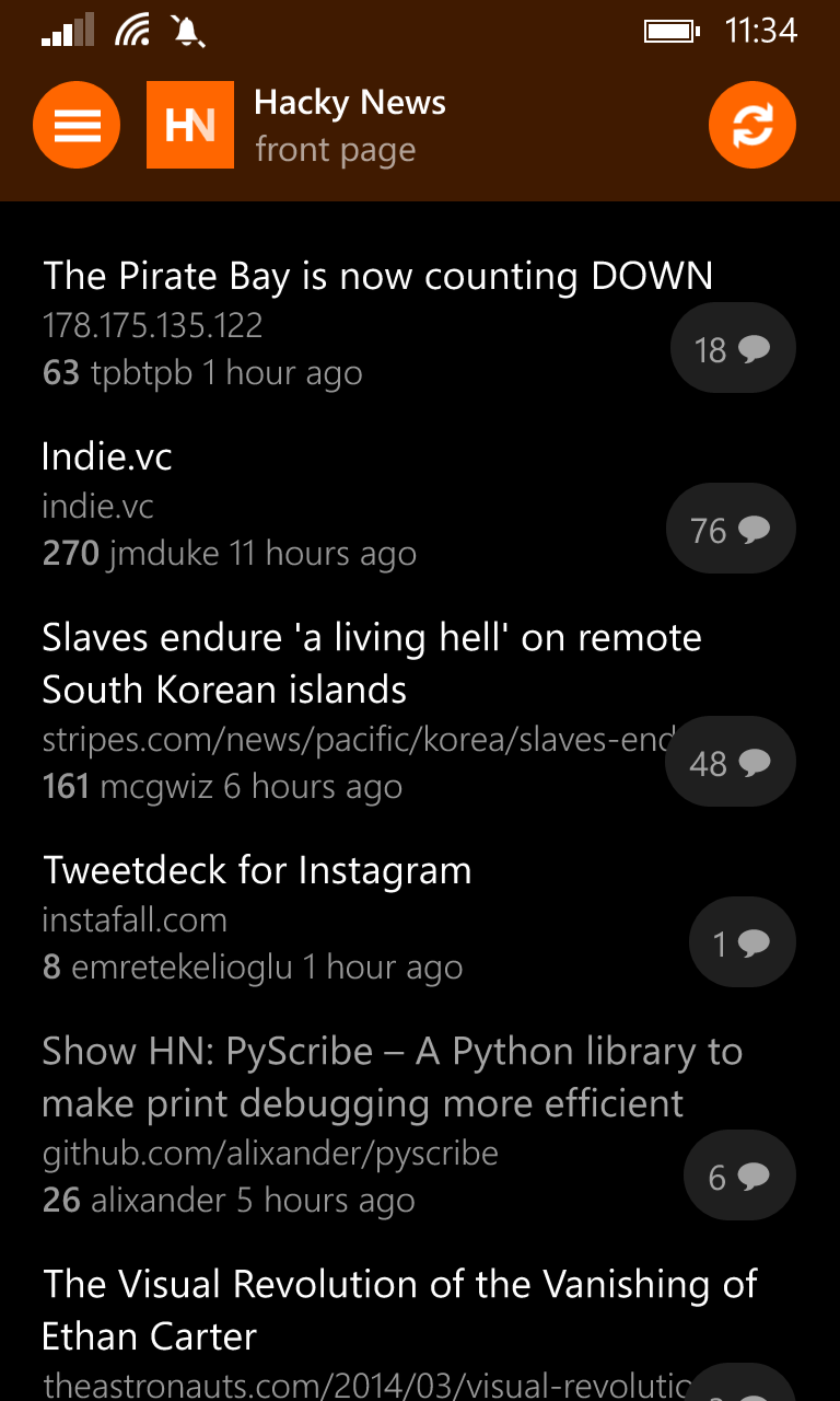
I released this app a couple weeks ago, but the initial submission [1] did not get any traction here so I thought I'd resubmit it. Hope that's okay. All the various sections and categories on HN are supported – the front page, new, show, shownew, ask, best, active, jobs. There's an integrated browser with mobilizer support, and you can instantly switch between the browser and comments with a simple swipe. Comment threads are color-coded and collapsible. This is my first non-trivial project that I actually finished and released, so I'd appreciate any feedback. [1] https://news.ycombinator.com/item?id=8663913 |
|
|
Not to much of a fan of the colored bars for nested comments, shades of the same color (we already have an accent color on WP) might be nicer. Might also be nicer to people who are colorblind.
The address/toolbar below the article feels more like Android than WP. On WP you usually get an explanation of icons in the toolbar when stopping up because their captions are right underneath the low end of the screen. Took me a while to figure out what the icons meant which IMHO isn't that great UX. Also a reason why I like the toolbar design on WP, because it's compact and supports labels if the user needs them. Not sure how to incorporate the usual toolbar design into the current workings of the app, though.
When tapping the '...' button the animation of the ellipsis feels like it rotates around the wrong pivot. It doesn't do so when swiping to the left. Maybe that's because the scrolling left animation of the bar is eased when tapping the button and the rotation animation is not. Maybe its even easier to bind the rotation angle to the current horizontal shift of the bar (coming from WPF here, so maybe it doesn't make sense).
Clearing the browser before loading a new article would be nice. Loading takes a while and tapping on a headline just to see the old content can be a bit strange.