http://cdn.cultofmac.com/wp-content/uploads/2014/07/iwatch-i...
https://encrypted-tbn3.gstatic.com/images?q=tbn:ANd9GcTtB7RX...
The Moto 360 looks better because it's round but the UI is made for a square device.
Whereas this appears to be a reimagination in an authentically digital and modern format. The iWatch is already looking outdated IMO.
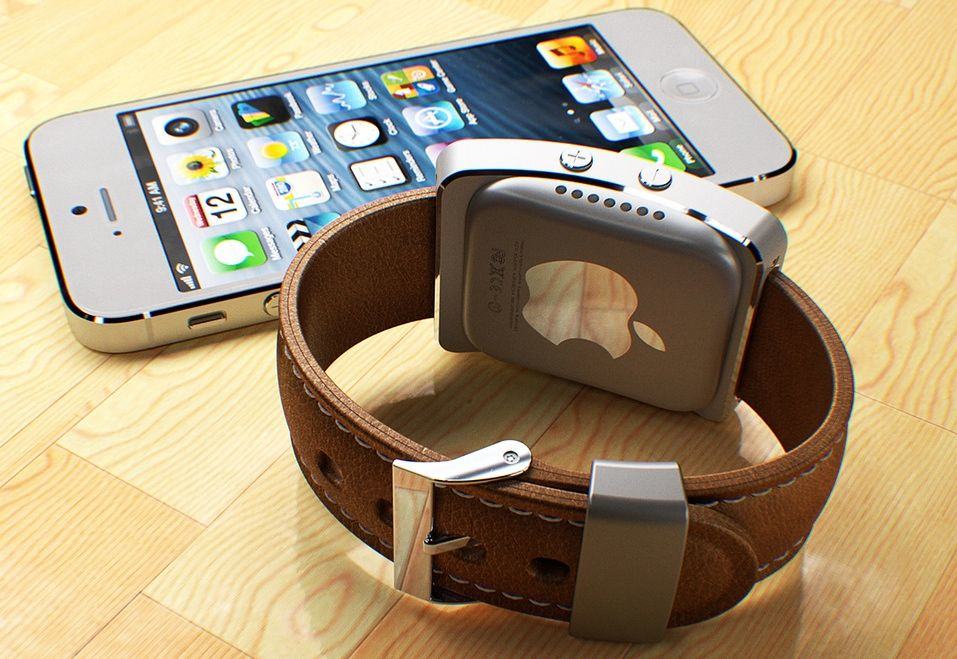
Apple's wrist worn product is not called iWatch, and that linked picture is not of an Apple product.
Apple's wrist worn product is not called iWatch, and that linked picture is not of an Apple product.