Hacker News new | ask | show | jobs
by cbr 4280 days ago
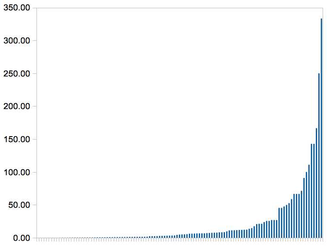
This approach would make sense if most charities were similar in how much better they could make the world with your dollar. But instead there are huge differences! For example, if we look just at developing world health we see a power law distribution, where a few interventions are much better than the rest. [1] Instead of signing up to give small amounts to lots of different organizations, it's much better to find one working on one of these best approaches (givewell.org is helpful here) and fund that more.

[1] http://www.jefftk.com/daly-per-1000-usd.png

1 comments

a chart with no labels on the axes communicates almost nothing
Sorry! I forgot that the axes were in the surrounding page not in the image.

Vertical is "$/DALY" which is basically the cost-benefit ratio of a medical treatment. $100/DALY would mean $100 to give someone an additional healthy year of life. The horizontal axis is a wide range of developing world medical interventions, lined up from worst cost-per-daly to best. You can see that the very best ones are much better than most of them, though even the "worst" ones are still excellent value for the money both in absolute terms and compared to what additional health spending gets you in rich countries.