This study is misleading, because it uses 'household' wealth, instead of individual wealth, and may be incorrectly interpreted as showing a decline in the middle class, when it is really showing the results of changes in family structure over the past 50 years. This graph shows how this choice affects the results: http://1.bp.blogspot.com/-g3WZGpDibPM/Up3ZAPRtScI/AAAAAAAAJq...
Supporting 1 person on x income is harder than supporting two people on 2x income. Put simply, a couple does not need two stoves, and any shared trip is less expencive etc. There are a few edge cases at the individual level for things like end of life care and taxes, but the overall economic bennifits are huge.
It's a generally around a 1/2 a % penalty which is swamped by other benefits.
AKA 2 incomes of $87,850 x2 = 175 700 vs extra 879$ in taxes.
At extreme incomes of say 20+M a year or below 18k it's actually far less than 1/2%.
However, there are huge benefits for SS for being a married couple even more so if there is a large income disparity, so on average if they plan ahead Marriage tends to lower taxes. On top of lower expenses which enable better tax avoidance mechanisms.
Calling it misleading is stretch. There are dozens of factors that you can cherry pick to cast aspersions on the increase in inequality but if you step back they don't come close to explaining it. There are another dozen that can be chosen that do the opposite.
Very interesting reads, thank you for sharing them.
However, just looking at the time scale over which the net worth changes described in the original article occurred, and their magnitudes, it doesn't seem likely that the effect they describe can be explained so easily by social factors. Hypothesizing that it's just a social change related to shrinking households leads to some interesting questions about what that really means in practical terms: Did the bottom 5% go from an average net worth of -$9K to -27K over the course of a decade because, on average, three individuals in the red would get together to form a combined household with pooled debts? Did the 25th percentile go from an average of $10k to an average of $3k because of parents getting divorced and kids moving out en masse? Meanwhile wealthy people's family structures remain static.
I think the data you link and the data in the article are reconcilable. Income and wealth are different things, after all. Perhaps wealthier folks' net worth dropped less precipitously during the Great Recession because they experienced nothing worse than a drop in the valuation of their primary residence. Meanwhile less wealthy folks suffered a greater loss because they were more likely to get foreclosed on, therefore suffering a loss of all the equity they had built up in their homes. This trend wouldn't show up as much in the income numbers because losing your house doesn't necessarily coincide with losing your job, certainly not the way things were playing out in 2008.
Not sure why someone voted you down, that quite believably would play into it and certainly doesn't seem to contradict the numbers in the paper in any obvious way.
(The wealthiest folks did see an increase in wealth over the 10-year time considered by the paper while everyone else saw a loss, but that's possibly because the wealthiest 10% also had a comparatively smaller amount of their assets tied up in their homes to begin with.)
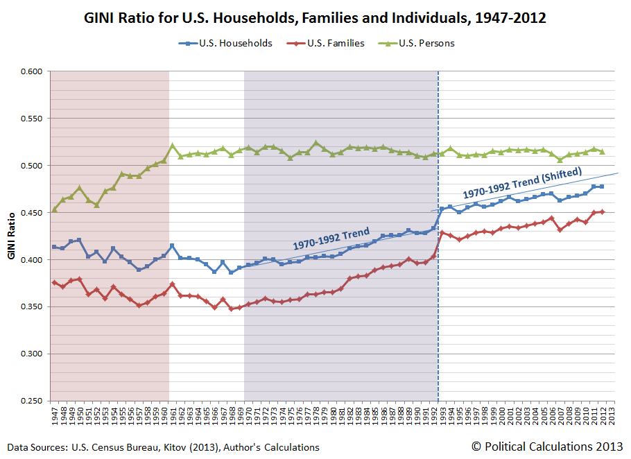
Wow, very interesting that GINI by individual is fairly constant.
However, household GINI is definitely the more relevant figure, as most big economic decisions (where to work, where to live) are made at the household level rather than at the individual level.
But the number of households is strongly influenced by people's personal social decisions such as divorce or living with relatives. Thus the household GINI is strongly influenced by people's personal decisions in addition to their economic circumstances.
More concretely, if I divorce my wife and we become two households does that mean that US economic inequality has increased? I would say not, but the household GINI would say that it has.
If social circumstances make for a increase in divorces or a change in the fundamental structure of the family, I don't see why it's not something to take into consideration beyond "personal decisions".
Could it be that conservatives might actually be right about that?
Since when is "wealth" inequality a "socialist" thing? It's a matter of such importance that The Economist considers it the most pressing issue in economics of our times.
There is also nothing "socialist" about the publication. And the fact that the stats may be skewed by certain underlying variables (like every other study on Earth, who knew) does not invalidate the findings, although it does invite for further refinement of the data for more conclusive information.
I would say that yes, US economic inequality has increased, quite concretely! Unless you both have precisely the same income post-divorce, as a couple you were more equal than when single.
That's interesting, but it makes me wonder about the value of GINI as an indicator if it hides the obviously horrifying effects the 2008 crash had on the bottom quintile and the very bad effects of driving median wealth into negative territory, where it remains stagnant.
I suspect a lot of people reading this board and living in Silicon Valley and other tech boom towns don't feel what that graph is saying in terms of day to day impact.
You are correct about the chart, but if you look at the second and third blog-posts, you will see how family structure has changed, and how it will have a similar impact on measured household wealth. I wish that I had a similar wealth distributions graph handy, but this was the best source I could remember, and I think it serves to adequately demonstrate the point.
It’s a fair critique, but it really doesn’t come close to explaining the 2003–2013 data.
The ratio of 95th percentile household net worth to median household net worth doubled from ~9x to ~18x. That’s not just some artifact of changing family structures. That’s a massive increase in wealth inequality.
Basically, your point is interesting, but in context it’s mostly a distraction. (But I agree that a chart showing individual rather than household wealth would be nice to see.)
I think you are right that those blogs do not fully explain what happened after 2003. It seems like the measured wealth dip (amongst all groups) from 2007-current is quite consistent with losses due to the drop in housing prices from the great recession (though I have no solid data to back this up). Lower income households tend to have a greater proportion of their wealth tied up in housing (and with less home equity due to a variety of factors including low down payments in those years), so they were likely disproportionately (negatively) impacted.
I am not sure what could explain the changes between 2003-2007, though I would be very interested to hear any ideas.
This study is misleading, because it uses 'household' wealth, instead of individual wealth (...)
Perhaps, but there is no hard data at the individual level because, as it happens, basically every comprehensive dataset on income or wealth relies on tax or census data, which are aggregated at the household level by design. So any empirical claim about individual-level data should be taken ex ante with a big grain of salt and evaluated carefully; especially in a heavily politicized field like economics where data is scarce and motivated reasoning reigns.
Take, for instance, the graph you cite [1], which cites Kitov and Kitov (2013) [2] along with the US census bureau as a source. The problem is, what that paper provides is not an empirical dataset but a microfounded model for predicting individual income --with all the problematic epistemological/overfitting caveats that they come with. Presenting that graph as an empirical fact and not as a debatable modeling exercise is quite misleading.
Besides, as others have pointed out, all the links you provide discuss income, not wealth (and no, their arguments/reasoning about income do not readily/trivially translate to wealth, as you commented below). If you are interested, check out the work of Cheryl Doss [3], who has conducted actual empirical work about the differences between household and individual equality in Ecuador, Ghana and India.
(PD: Oh wow even their claims about changing family structure in that blog [4] is disturbingly model-dependent. Much is made about the percentage of single-person households following an S-shaped curve, inflecting at 1968. However, they fit a sigmoid to what is a patently linear trend in the total number of single-person households beginning in 1950, and extrapolate back to 1900 despite having only two data points for that period. This wouldn't pass even a cursory peer-review, sorry.)