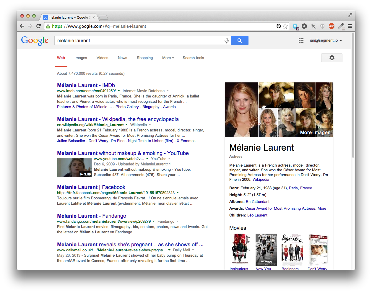
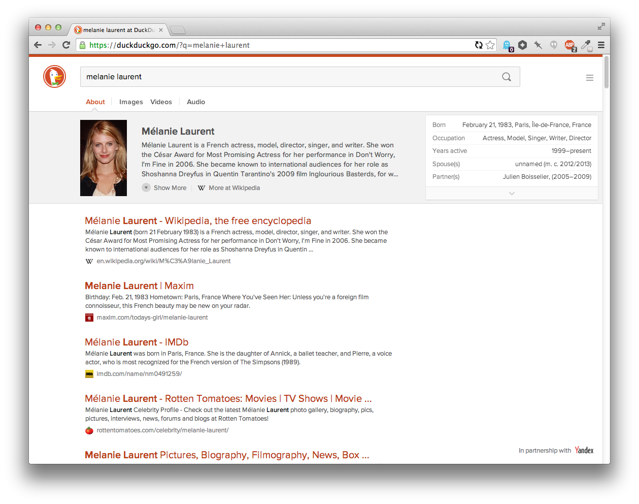
| This is a really amazing direction in terms of design. Like most people probably, I've pretty much ignored DDG because it didn't seem to be doing anything more than Google already did, but this design is really interesting for going in a new direction. The only thing that stands out to me as less useful than the equivalent Google search at this point is the hiearchy of the results. Google uses a link-like blue color for the titles of each result, which seems like a leftover from a past age of the web, but is actually useful for scan-ability because the text of the headers stands out. Compare the current DuckDuckGo... https://i.cloudup.com/vrwZgUkOty.png ...to Google... https://i.cloudup.com/eFCFEE5TYG.png ...to an adjusted version of DuckDuckGo... https://i.cloudup.com/jluIYZWtzz.png Having an extra color for the headings lets you scan the page much more easily, which lets you get to the result you wanted faster. The downside is that since their brand color is red, it feels "best" to have the highlight color red. But then that has some negative emotional connotations. Tried green as well, but it didn't stand on it's own enough since there's so little green on the page. Anyways, I've switched to DDG as my default and will try it out for a while again. I also love those favicons that show up next to the domain names. |
Btw, you can make it your default today by playing with the ddg address parameters:
https://duckduckgo.com/?k9=%23b02900&q=melanie%20laurent
This solution is preferable to changing colors in the settings screen if you regularly delete your cookies (and with it the custom colors) - just change your browser search engine shortcut.
More info: https://duckduckgo.com/params