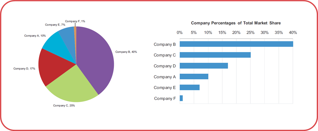
| I want to call particular attention to the author's point about Apple's pie chart. Not only is Apple's pie chart used for telling lies here, I would argue that all pie charts are used for telling lies. The only thing a pie chart gives you is it tells you that everything in a category adds up to 100%. It doesn't tell you what 100% is, or why 100% is good, or bad, or let you compare across charts, or set goals. You can accomplish this same thing with a bullet graph, developed by Stephen Few. You make a bar chart, then put a line through it to represent your goal (or 100%). Then, it's simple to compare multiple categories and model very complex information in a simple to understand way. So remember this: The next time you see a pie chart, know that someone is lying or trying to appear more impressive than they actually are. The worst part about this particular way of graphing information is that it's so ingrained in our culture (it's taught in Kindergarden), that people don't even understand that they're lying, even when they are. |
However I fail to see how they are lying because they used a pie chart... back in 2008 they are saying that Apple had roughly 20% of the market share of smart phones.
They are vague in explaining whether they are measuring - devices sold, devices in use, devices pre-ordered... however that would be the case whether they used a bar graph, line graph, or just gave the raw numbers.