Y
Hacker News
new
|
ask
|
show
|
jobs
by
joshuahedlund
4710 days ago
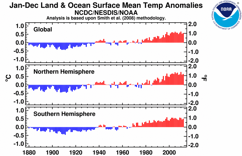
It's not as pretty, but NOAA's single graph looks smoother for both hemispheres[0]. Then again, one's an average of an anomaly, the other is averages of real temperatures.
[0]
http://www.ncdc.noaa.gov/sotc/service/global/lo-hem/201201-2...