Hacker News new | ask | show | jobs
by misnome 4927 days ago
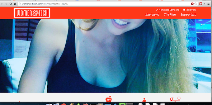
Is this thread title a joke? Or Sarcasm? I'm on an 11" air screen, and I feel like I'm looking through a very thin Letterbox, meagrely scraping together a few words of meaning before having to re-adjust my position to get more of the picture.

In fact, scrolling down past the title, and the header image, leaves one state of the page display to nothing but a half-cutoff flowchart, the bottom of a chin, and the rest of the picture is taken up by cleavage. Probably not the intended effect. (Edit: Like So: http://xgkkp.com/images/screenshot_mostbeautifulpage.png. I'm not going to read a page called "Women And Tech" that thinks that is a good way to target their apparently intended demographic)

2 comments

It looks great on a big screen, though. So I guess the title should be renamed beautiful site that looks great on a big monitor but cramped on a little one.
It looks like it scales to the current width, so presumably a very wide window on a big monitor would look just as bad?
It looks horrific on my 1920x1080. Enormous scary pictures, giant text that's still only taking up half the screen. I hate design.
It looks great full screen on my 1440x900. I'm not sure if that qualifies as big though.
The title wasn't a joke. I love the way the interview is presented. The team clearly put a lot of time into it. I especially love the collage they created of a bunch of the women who have attended Ladies Learning Code workshops. It was really unexpected, and I was blown away when I saw it yesterday morning.