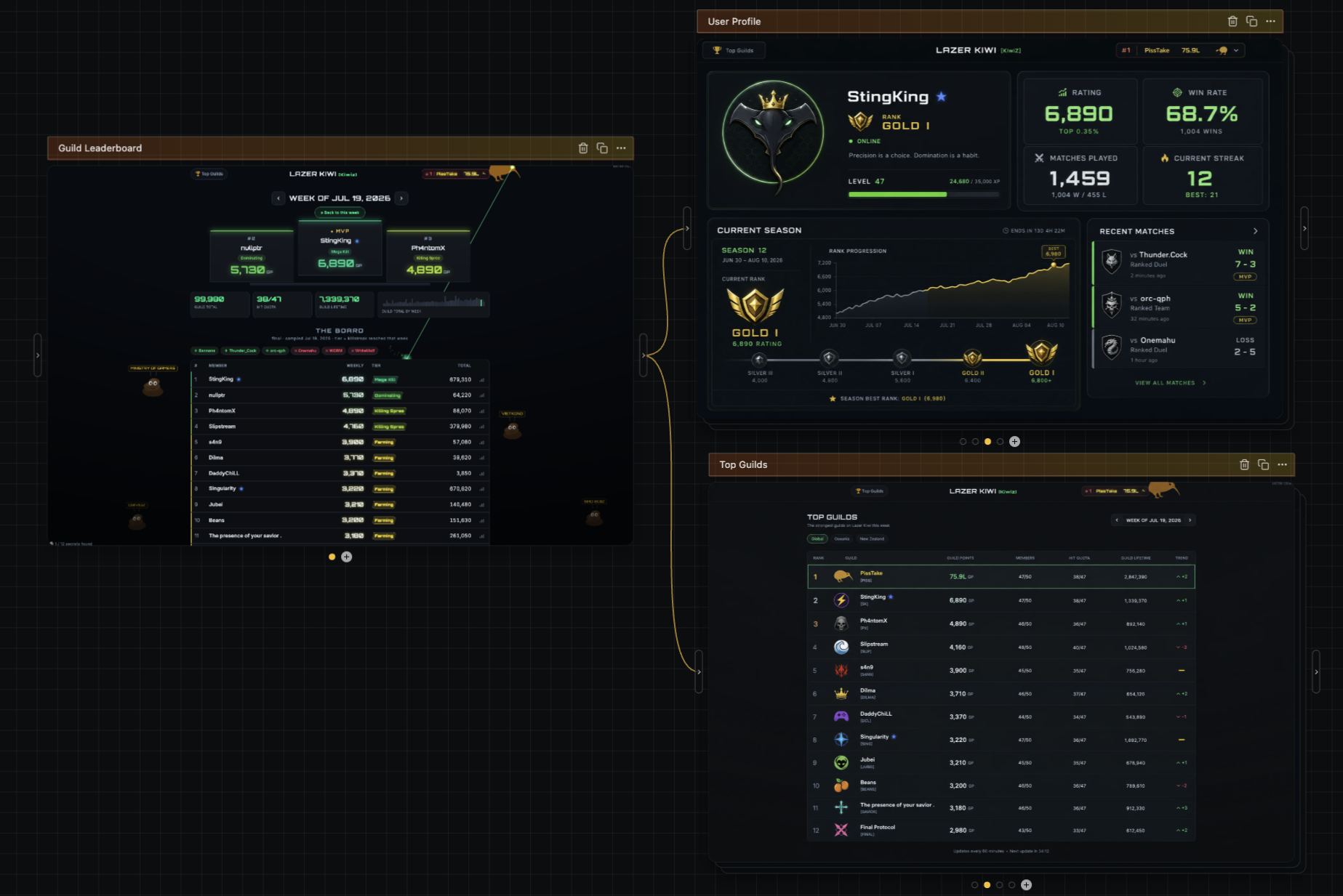
| > There are other aesthetics my brain associates with AI, like beige/cream colors, orange accents, and serif typefaces Something to consider regarding the narrow space AI-created designs align on: LLMs are trained to write consistent code. This makes sense for something like a billing or a backend function - you want that code to be consistent. The problem though is that LLMs write code to represent designs as well, which means you get consistent designs. You end up aligning on a generic mean because of it, which is often why you see these repeated aesthetics. It was something I saw when I was working on AI tooling over at Figma. It was very hard to get creative, unique outputs out of LLMs. One thing I'd recommend if you're trying to avoid this is try a diffusion model as a starting point. Gpt-image-2 is a VERY capable designer, and Opus and Fable are fantastic at converting images to webpages. Starting with images will let you sidestep a lot of the uniformity of output that LLMs have. I'm heavily biased here as this is what I left figma to build (https://news.ycombinator.com/item?id=48995754), but even starting with gpt-image-2 to give you a general sense of the look/feel will heavily differentiate you on the design front. Here are some examples of image->webpage outputs I've been playing with: https://html.non.io/tarot/ https://html.non.io/neonRamen/ |