|
|
|
|
|
|
by krige
12 days ago
|
|
|
To me the pinnacle of icons was always the MagicWB [0] / MUI [1] style, even though I never really had MagicWB on my systems. Maybe strange choice of colors (pale blue, pink, orange?), but nice dithering and color interplay to create neat 3D illusion built nicely upon the OS 2.0 look. [0] https://en.wikipedia.org/wiki/MagicWB [1] http://www.sasg.com/mui/preview.gif |
|
|
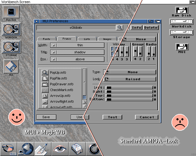
As for MUI, it was a fantastic system for programming user interfaces and for displaying user interfaces, and it's one of the great tragedies of computing that nothing of that calibre exists today as a cross-platform user-skinnable UI toolkit.
It was however, very slightly lacking (on the Amiga) as a system for using user interfaces because it lacked that sense of immediacy for which the Amiga's UI was previously known.
With traditional Intuition gadgets the rendering was done within a high-priority system task, so if you click on a gadget you'll get immediate visual feedback even if the application isn't ready to respond. With MUI the drawing, and thus feedback, doesn't happen until the application's paying attention. Because of that, MUI applications felt non-native. (Even Windows-like!)
That might not seem important in today's world where that level of responsiveness was burned on the altar of network backends and web presentation layers, but that sense of "having the computer's full attention" is a big part of why the Amiga still has fans today.