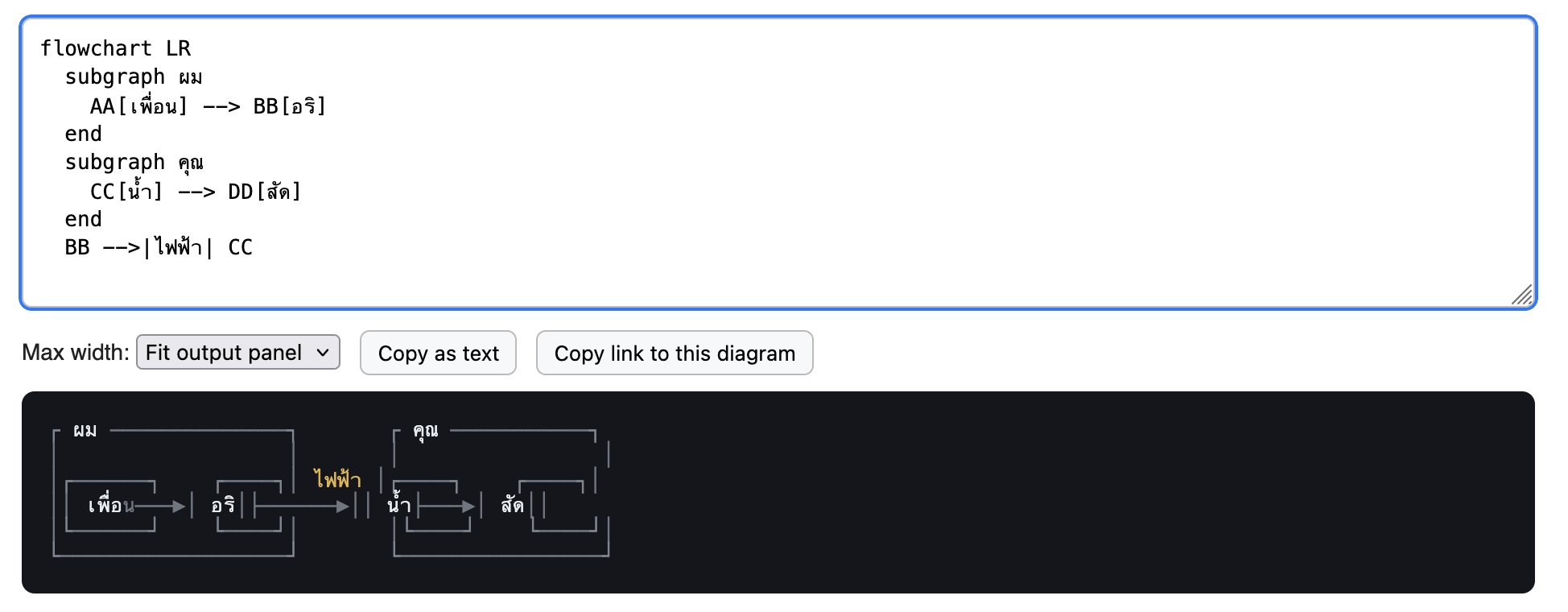
The first issue is due to the assumption that character count equals character display width. Thai tone markers usually[1] should not contribute to the display width (เพื่อน is chars = 6, width = 4), so it caused a layout shift.
The second issue is due to the program's layout engine not adjusting the glyph width of a fallback font to that of the main font. A lot of terminals do this, but it's not common for text editors or browsers (arguably this is the correct behavior for non-terminals, since you cannot assume everything must be snapped to a grid).
Fun test for this:
     |กล้วยหอม|
     |Bananas|
This has the same character width. Ghostty, etc., will render it correctly (| aligned). Most browsers and text editors will not.
[1]: some layout engines render free-standing tone markers as 1 character; in that case, this rule only applies to when tone markers are following a character.
This isn't a renderer bug, it's font. Proportional fonts aren't designed with alignment in mind at all, and you can't just expect monospace fonts for all languages outside of ASCII range to be present on random systems, or a single font or font family to support multiple different languages consistently.
You can't really control alignment of deeply Unicode characters like Thai or "→" against monospace characters without serving your own monospace fonts that are guaranteed to work for the characters you'll be sending out, assuming you can always have one in hand.
You can still handle this well enough in the renderer, so I'd still consider this a renderer bug - e.g. my terminal emulator will scale any glyph that exceeds the bounding box as defined by the expected number of cells for a given character range. You can't expect any given feature of random characters to align, but I can expect box drawing characters surrounding any given characters to align correctly or consider it a bug (my terminal is almost certainly going to get CJK and Thai wrong - it's entirely untested -, but if so it is a bug, not a font issue).
That includes if I have to fall back, including fallback to proportional fonts, which will look ugly, but work and remain aligned.
ok... I disagree, and I mean no offense, but there's going to be too much contexts and nuances to be taken into account that it's probably not worth trying for both of us. All I can say is that the problem is not that the pipe characters are given inconsistent width but that non-ASCII characters has all different random widths, and if you need texts with double-width characters like ▶, 漢, ก, etc., to align in a grid, you have to pick a fixed-width(not "monospace") font for the specific language and exclusively use that font for everything within that contiguous text area. Or you can try to fix Unicode so that symbols become variable width so to align to grid or something, but that's going to take a lot of effort.
No, you don't need to pick a fixed width font for that. You will get the best results with one, but rescaling the glyphs works just fine. I've written a font renderer. It's not hard.
In fact my terminal, using said font renderer, rescales glyphs by default because even a lot of "fixed width" fonts are buggy and not truly fixed, and so enforcing the grid alignment and scaling to fit was the easiest way to ensure consistency.
Mixing and matching fonts for full coverage works fine, especially for wide characters.
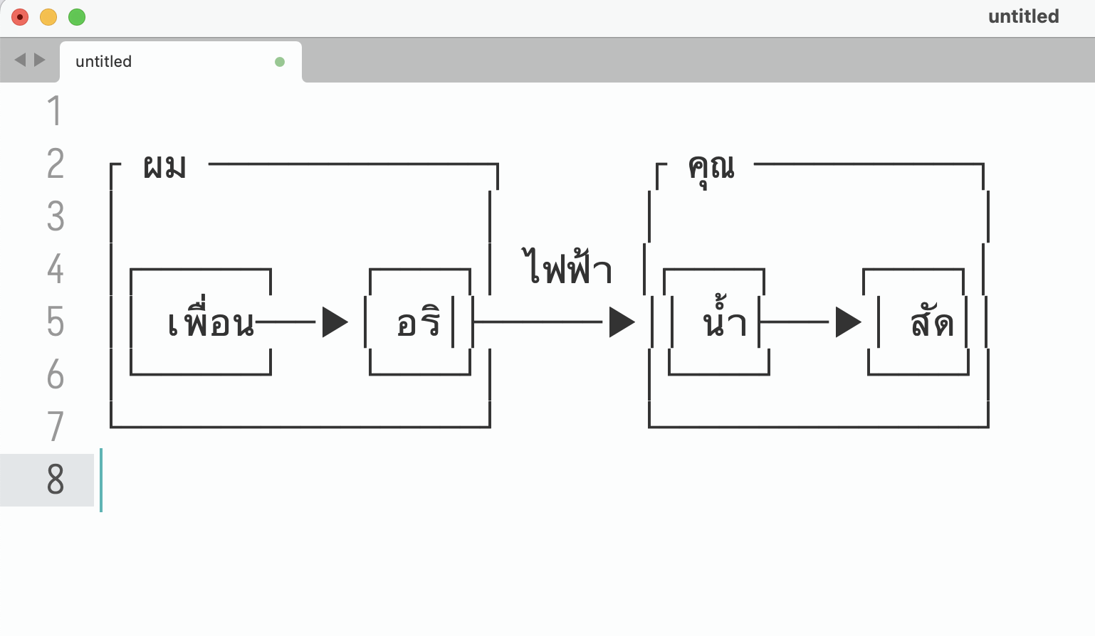
The second issue is due to the program's layout engine not adjusting the glyph width of a fallback font to that of the main font. A lot of terminals do this, but it's not common for text editors or browsers (arguably this is the correct behavior for non-terminals, since you cannot assume everything must be snapped to a grid).
Fun test for this:
This has the same character width. Ghostty, etc., will render it correctly (| aligned). Most browsers and text editors will not.[1]: some layout engines render free-standing tone markers as 1 character; in that case, this rule only applies to when tone markers are following a character.