Hacker News new | ask | show | jobs
by Taek 27 days ago
I wish software apps had "tape-out rules" the way that computer chips do. Basically, when you design a computer chip, a program reviews the design and compares it against something like 300 pages of rules with stuff like "wires of X metal and Y metal can't be within Z distance of each other".

We could make something similar for UX. Just a bunch of design pattern constraints that throw flags if you try to ship something with well established UX warts.

1 comments

There’s effectively no universal list of UX warts people agree with.

The Flat UX fad was objectively terrible on just about every metric I was taught, but people were actively pushing for such designs.

Why was that? What causes such fads? Why did everyone go along with it?
Speaking entirely out of my ass here:

FOMO for sure is one of the driving factors.

"We cannot risk looking outdated". So weak management, probably.

But also talent availability I suppose. If there's a new trend, the pool of people you can hire include many that are in on that trend.

UI frameworks too, probably. The modern thing™ does the modern thing™ and you do want to be on the modern thing, because you fear that only that receives security fixes or whatever.

If UIs today still looked exactly the same as Windows 2.0 or System 7 or CDE people will be bored to death. Aesthetics come and go and come back, it's part of how humanity worked for a few centuries already.
Do I need to be entertained by my butter knife, mop or screwdriver?

I really don't think that "keeping people entertained" is a sensible goal within the context of building software as tools and not software-adjacent Art.

Which is not to say that I would not want a great and polished experience, but that is not equivalent to "being entertained".

___

It would be nice if not everything one interacts with would try to get some sort of emotion out of me. Bring back being bored.

For some of us, the OS isn't a fashion statement, but rather a tool which is to be used to achieve other goals. It shifting around and changing its look is in fact a downside in that context.

I don't think I know any non-tech people who like things changing about. Some tech people like that (I don't), but for the non-techy, it's just another thing they have to relearn for no good reason.

Why do people say that? I am not bored by my Braun alarm clock, neither by my Singer sewing machine or my De Buyer cookware. Why would I be bored by well executed digital desktop designs such as BeOS, AmigaOS or even Windows 2000?
> people will be bored to death

As opposed to what? Be entertained by all the bells and whistles of modern operating systems that have practically unusable user interfaces?

Make-work. Managers needing to justify their promotions with a new way of doing things. Whole teams are given a reason to stay employed. OS and device obsolescence is achieved. A win all around, save for the consumer.
What’s wrong with flat UIs? Skeuomorphic designs have served their purpose of helping people get used to computers, but now that is no longer necessary.
It’s not that it’s impossible to make a useable flat UI, it’s that people constantly forgot critical functionality.

You need to denote a button is different from text. You need feedback that a UI element was interacted with, and for toggles you need for people to be able to tell what represents on vs off. The borders between different UI elements needs to be clearly defined, etc etc.

If you introduce flatness without also adjusting the colors (or worse, making many backgrounds translucent) you end up with really poor contrast.
New people are born every day.
The newly born people grow up in a world where computers are already commonplace, so they don’t need to get used to them.
Wild take. They’re not born “used to them,” so at some point they quite literally need to get used to them…
The point is that a computer will just be another thing for them to learn, not a replacement for other tools they’ve been using for tens of years. Therefore, the computer does not need to look like those other tools in order to make sense to them.
Yes, but they'll be doing it between age of 2 and 7, not 20 and 90.
That fact that they are common doesn't mean they don't need to get used to them.
And? What does that have to do with the merits/downsides of flat UI?
Having people getting used to computers is not a thing that stops happening (short of people not having computers). Literally everyone who is born will need to get used to use computers.

Having computers imitate real world items is useful, because it provides a reference to other things rather than just being its own unique thing. This is useful even if you have never actually used it outside of a computer setting. A stereotypical telephone receiver icon almost always means 'call', even if you've never used a landline phone (much less one that's shaped like that icon usually is). Nobody has ever used a real-world hamburger menu, yet it's described in skeumorphic terms, since it's easier to explain and relate to.

You can reference other things without resorting to skeomorphism. Like using stars to represent favorites, typography to emphasisze/deemphasize things, the color red for warnings/errors, the color green for go/submit/ready, or the clearest of all: using descriptive naming in buttons and having self-documenting labels.

Skeuomorphic UIs absolutely have a place in things like games and tutorials for the youngest of children (like 5-6 yr olds, max), but past that, I honestly think labelling, a UI with feedback after significant inputs (like sounds, button states being extremely distinct, animations, etc), and not overcrowding the UI with too many controls and jargon will all go much further than skeuomorphism.

It doesn’t just help to “get used to” computers, it continues to help even after being used to computers for decades. The fact that it helps to better recognize and distinguish UI controls from content never stops.
This is a somewhat unpopular opinion here, however I do think flat UI can be done right and is well fitted to digital UIs.

It's possible to have a flat style but have buttons that look clearly like buttons, and elements that have shadows and colors.

The original GUIs were all flat because that was the default. A button was a rectangle with text in it. A checkbox was a rectangle with or without an X across it. Pure black on pure white, no colors or shades. Windows used this style until Windows 95.

Nobody seemed to have a problem with it. It was largely clear what was a button and what was a checkbox. In hindsight it was certainly uglier than the 95 style (maybe just because I grew up with that) but it wasn't unusable at all. As you say, it was clear what was a button, what was a checkbox. I think it was because GUIs were mostly made out of standardized elements whereas today we have everyone trying to put their unique spin on every element.

I might be misunderstanding what you're saying, but: In the PC space, Windows 3.x definitely had some skeuomorphic elements. This presents most-commonly with the minimize and maximize buttons[1].

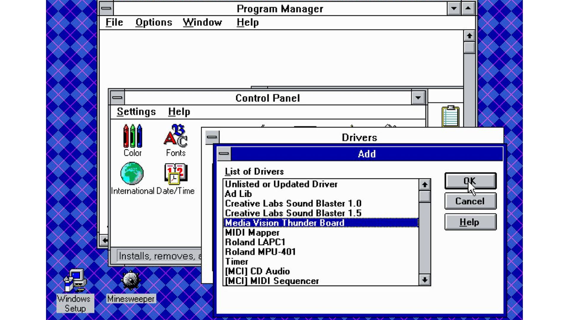
We have to go all the way back to Windows 2 in before we find flatness.

[1]: https://archive.org/details/msdos_win3_1

And Windows 1 and 2 were barely even used. Windows 2 sold less than 2 million copies. Windows 3 and co sold 7-ish million. Windows 95 sold more than 40 million.[1] There's a lot less people to complain about Windows 1 and 2, and those people were probably a lot more experienced in the first place.

[1] https://web.archive.org/web/20220418124401/https://techland....

I bet people had the same concerns with the transition from Windows 3.1's flat UI (only basic shapes were used) to the pseudo-3D effects of Windows 95.

Although in 3.1 it was easy to tell what was interactable, despite being flat. I attribute this to the use of standardized components almost everywhere.

3.1 wasn’t a flat UI as the shading represented light coming from the top left on a 3D button, windows 2 used a flat design.

https://www.custompc.com/wp-content/sites/custompc/2023/06/W...

But there are things like consistency which one can check for. And should.