|
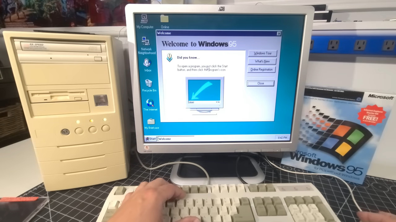
> Since that button down there is called "Start", it implies that you can probably do something with it, maybe start programs? Click and you'll see the Start Menu: Over time it seems like a lot of designs stop feeling the need to lead the user in this way. There is an assumption that by now everyone knows what the menu in the bottom left corner does, and we are no longer in the phase of trying to teach the population to use a computer for the first time. I feel like this is the wrong approach. Every day there are new young people using a computer for the first time. Wouldn’t it be nice if all these conventions that evolved over the past 50 years could be intuitively discovered, instead of needing explanations from someone who already understands them? Of course, as the world becomes more digital, many skeuomorphic designs become more abstract to those same young users. The floppy disk, the traditional telephone, even the file folder. |
The "Start" button made no sense. The computer was already started, and clicking randomly popped up menus and opened documents in their right programs, so it felt like the natural way to progress. The owner of the computer had to point me to the start menu.
Even now I still think it was a cursed UI. It was the place primarily to close and shutdown the computer (again, when you see that button the computer and OS will always be already started), get to the control panel or run commands. None of it felt like "start", and the current windows logo only design makes a lot more sense.
To your point, small kids get proficient very fast with smartphones and iPads. I'd call their interface a lot more "intuitive"