|
|
|
|
|
|
by PMunch
143 days ago
|
|
|
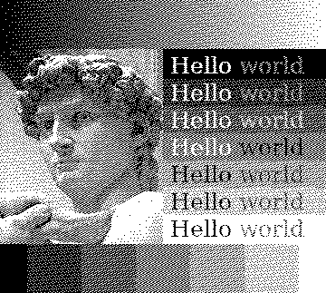
Just had a look at this and here is the result for the test image: https://uploads.peterme.net/test-image_qr.png. Looks pretty good! It looks a bit like a dither, but with fewer artifacts. Definitely a "sharper" look than blue noise, but in places like the transitions between the text boxes you can definitely see a bit more artifacts (almost looks like the boxes have a staggered edge). Thanks for bringing this to my attention! |
|
|