Hacker News new | ask | show | jobs
by tekne 217 days ago
This is an excellent article, but the graph is unreadable on mobile even with a relatively large screen.
3 comments

Also, at the end of the article:

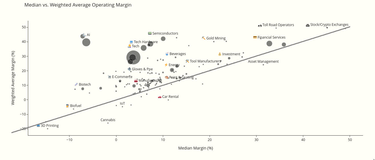
    > Appendix

    > The by-category margins are repeated in this table.
It's basically the same data in a more mobile-friendly table.
For the benefit of you and other small viewport users, here's an image of the plot, with a line indicating where the median is the same as the mean.

https://i.xkqr.org/medianvsmeanmargin.png

Though I do recommend exploring the plot on a full-size monitor too – it's zoomable etc.

Thanks. Guess you hacked the Plot.ly widget? Graph also needed dotted lines for 0s in y and x axis since some data points are close to those values.
> Guess you hacked the Plot.ly widget?

Paintbrush in Gimp on top of screenshot.

I did like famous visionary CEO Steve Jobs used to advice, and it read well enough

I held my phone sideways