Y
Hacker News
new
|
ask
|
show
|
jobs
by
silvestrov
302 days ago
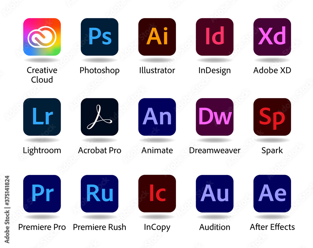
Adobe app icons are really the poster child for icons that are difficult to identify:
https://as1.ftcdn.net/jpg/03/75/14/18/1000_F_375141824_Urr3G...
Icons were not meant to be text to read.
1 comments
kridsdale1
302 days ago
Take a look at the icons for Google’s mobile apps.
link
glitchdout
301 days ago
Oh, that redesign was ludicrous
https://nathanboomsma.medium.com/why-googles-new-logos-suck-...
link