|
|
|
|
|
|
by fidotron
293 days ago
|
|
|
> In the example above, you can see that the OKLCH colors maintain consistent blueness across all of the shades, while in the HSL example, the lighter shades drift to purple and the darker ones muddy out towards grayish. There is a very clear shift towards green in the OKLCH lightness value change example, enormously more so than any purple vibe in the HSL example. Clearly being able to select colours of the same perceptual intensity has value, but some of the claims here as to the benefits are exaggerated. |
|
|
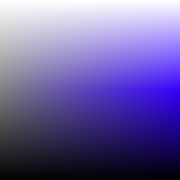
https://oklch.com/#0.7684,0.1754,218.1,100
To increase brightness past the limit of the Hue band for the color, the rendered output color on a display shifts cyan due to the limited brightness range of a saturated blue in the Display P3 color space. OKLCH is, when varying brightness along a gradient, Saturation-invariant rather than Hue-invariant; whether that effect is desirable is a matter of aesthetic preference, but after decades of Hue-invariant desaturated web color, it’s certainly refreshing to have a choice about which compromised invariance to take.
https://news.ycombinator.com/item?id=44588388
Science recently invented a much-deeper blue LED than we have now, so I expect in a decade or two, whatever ends up succeeding Display P3 will be much more able to represent that gradient without cyan-shift, and all of the years of OKLCH gradients created before that time will end up showing a more accurate blue gradient with only the colorspace change. In the meantime? Do whatever’s aesthetically pleasing; there is no Right Answer in design :)
ps. One could argue that a post-OKLCH colorspace should not accept the binary decision of Hue or Saturation invariance, and instead should be Saturation-invariant to the display’s native limit and then transition smoothly to Hue-invariance at that threshold. I believe that’s a Difficult Problem in color profile specification terms, since it isn’t just pre-calculating the changeover threshold for all monitors (not to mention, do you change blue sooner or same as red, etc) but it’ll be a while longer before I’m versed enough in ICCv4 to explain that perception. It sure would make for an interesting experimental DisplayCAL target, though!