|
|
|
|
|
|
by ndriscoll
309 days ago
|
|
|
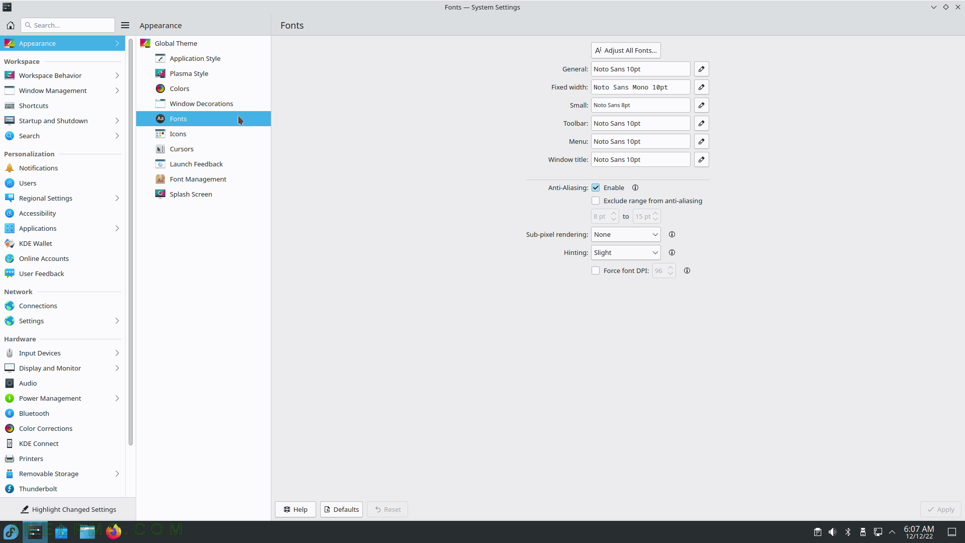
The screenshot from the article is for a single application that doesn't really have settings. The system settings panel does have a sidebar with separators, including group labels and contrast/color to make it easier to find things instead of a big panel of gray on gray. So... better than GNOME. Here's a screenshot I found: https://static1.ahelpme.com/public/media/tutorials/review-fe... You can also see that the KDE settings screen can fit more than 3 options at a time without scrolling, which is appreciated. That said like I said I do sometimes feel that their more modern themes have random extra spacing that would be nice to be able to remove. Better then all the other modern DEs though (except for power user window managers like i3), so in that way they've done a fantastic job. KDE is vastly more usable than the alternatives, including commercial. |
|
|