Biggest change seems to be that everything is round and purple now. It looks more playful and less professional.
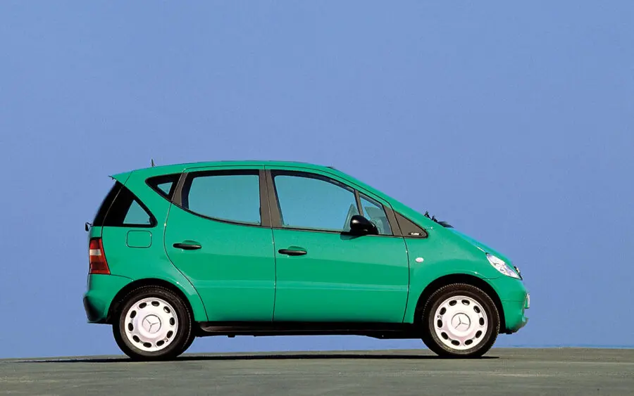
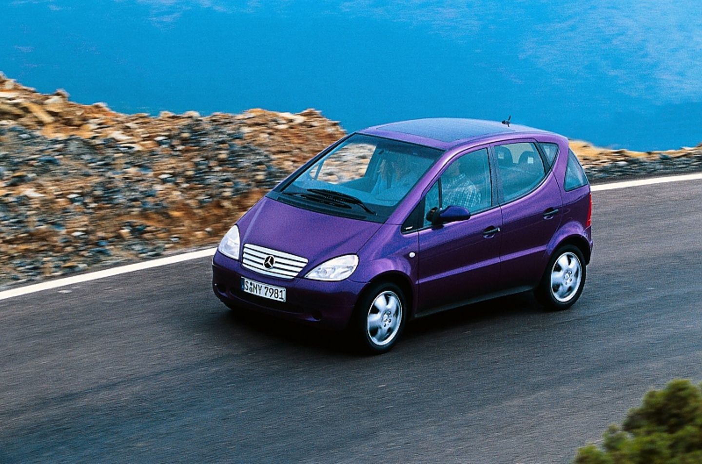
Edit: I dislike their recent color picks. First that teal in Google Maps, now the purple. Why? Are they trying to copy the color paltette of the first Mecedes A-Class (aka "Listerine" colors [1][2])?
That's intentional. Google's UX research is telling them that's what users (between 18 and 34 specifically) want more of.