Hacker News new | ask | show | jobs
by eps 439 days ago
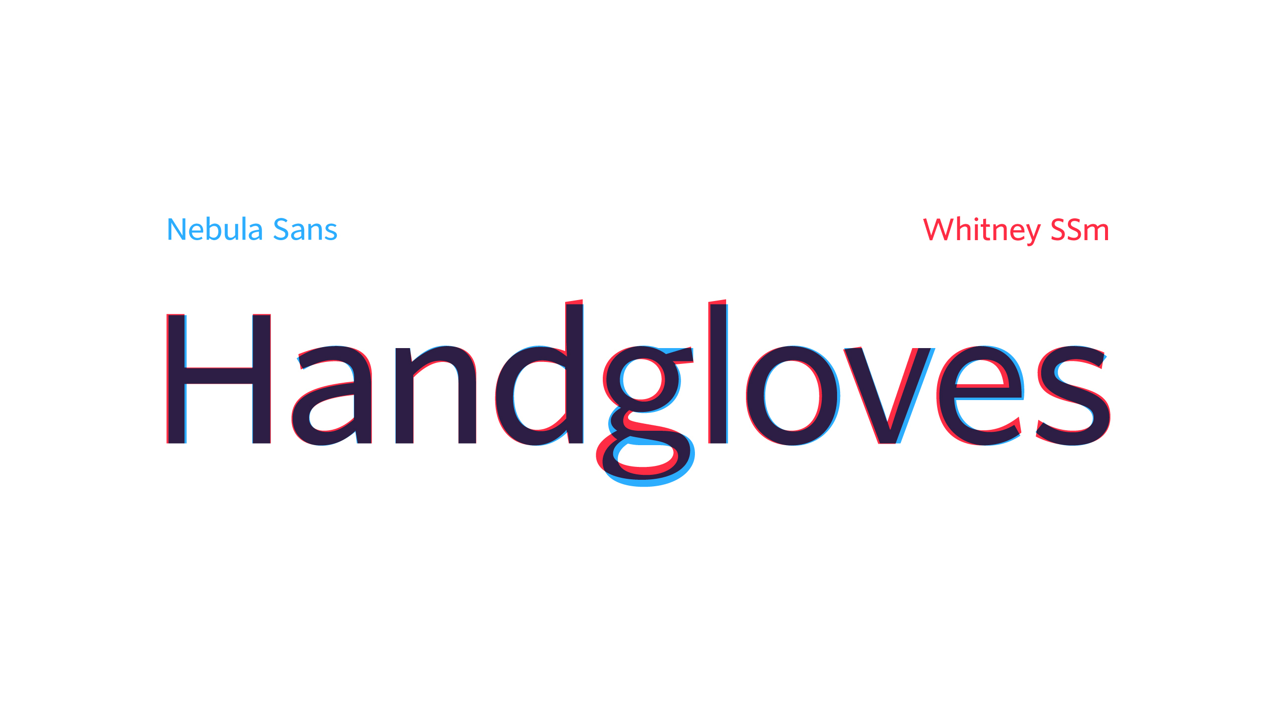
Little PSA:

a) This is a clone of Whitney, an incredibly beautiful and unique typeface from 2004

b) Whitney was designed by Tobias Frere-Jones

c) He was an equal co-founder of the H&fJ foundry

d) He designed the vast majority of their most famous fonts, including Gotham, Archer and Armada

e) Somehow, for years, Hoefler never did the paperwork to confirm FJ's co-ownership

f) When pressed, he instead kicked FJ out, kept all the fonts and renamed the shop "Hoefler"

Hoefler is an asshole. A free clone of Whitney is the least of what he deserves.

5 comments

All true, except it’s not really a Whitney clone. It’s Source Sans very lightly adjusted to match Whitney’s metrics. It looks and feels exactly like Source Sans to me. It’s a little strange to present it as a prestigious project with a minisite like this.

Source Sans is nice and easy to read, but so overused it’s rarely a good starting point for a visual identity.

I saw that. Here's a quick similar comparison between Nebula Sans and Source Sans I just whipped up: https://imgur.com/JPwgYkj
It's more about overall look and feel, which in large part comes from the glyph proportions (the x-height), spacing and weights - https://i.imgur.com/mygqn3H.png

Glyph proportions between Whitney and Nebula are almost identical. As are their weights. Source Sans is substantially heavier and more dense looking.

While individual glyphs may be closer between Nebula and Source Sans, but the overall feel of Nebula is that of Whitney.

Failed rebuttal of tobr's clearly true statement. Your own png refutes your position.
So, it's worse than Source Sans because it removed the differentiation between a lowercase L and an uppercase i.

I'd rather use Source Sans then.

Tangentially, there are two versions of Source Sans worth considering afaik:

* the latest OTF

* the Source Sans 2.020 TTF, which is the last version (at least, the last version released in the GitHub repository[0]) that has manual hinting

[0]: https://github.com/adobe-fonts/source-sans/releases

The two typefaces couldn't look more different. Look at the stroke cuts on the ascenders of the 'd', 'l', the stroke cuts on the 'a', 'e', and 's'.
Is there some online tool for comparing fonts that way?
I’m wondering why they’ve added the slanted top on ‘t’, but not the other letters: https://nebula.tv/videos/nebula-sans?t=363
They're very upfront about it on the page:

> The majority of the adjustments we made were to adapt the metrics of Source Sans to better match those of Whitney SSm

This is not a clone. They just matched the *outer dimensions* of Whitney, so that they could swap out their old font and not have to remake all their typography.
Not 1:1, but it has an extremely similar look and feel. In how glyphs are cut and the rhytm of the typeface.

Scroll down to "Comparison of Nebula Sans versus Whitney SSm" part of the linked page.

I was literally going to complain here that it was a Whitney clone before seeing them mention it on the page.

> the rhytm of the typeface

That's what the parent commenter means by 'They just matched the outer dimensions of Whitney'.

In other words, metrically compatible. To the untrained eye, metrically compatible typefaces all look the same, because they're meant to be swapped between each other. In my view Whitney and Source Sans couldn't be more different. The stroke cuts in Whitney are angled, they're perpendicular in Source Sans. The lowercase 'b', 'e', and 'g' are very different in both fonts.

They have a comparison at the bottom of the page. Some letters are dead ringers, some, like "g", differ significantly.
Except for the ”H”, none of them are particularly similar to Whitney. It would have been more interesting to compare the glyphs to Source Sans. Its ”g” is basically identical to this one.

EDIT: I created such a comparison. See neighboring subthread.

I'd say this is Source Sans. I'm sorry to trivialise Nebula's effort, but this seems much ado about nothing—they warped Source Sans' glyphs to be metrically compatible with Whitney, renamed the result 'Nebula Sans', got a developer and videographer to produce a whole website and mini-documentary on the matter and called it a day.

Excuse me?

Reminds me of that Bill Gates quote, "I get the laziest programmer to do the hardest job because he'll find an easy way to do it."
While I’d truly love an open source Whitney alternative (and have looked for years for one), this isn’t it.

Nebula has flat terminals, Whitney has angled terminals.

(There’s a lot of other differences but that one effects most letter shapes).

It looks like every "designer's font" introduced since the designers went insane over the iPhone.

Anyway, I'd like sans serif fonts more if they were readable, including being able to distinguish Weird Al from Weird AI.

How do we know that isn't TFJ's story, that Hoefler doesn't have a very different one, and what the truth is?