Visible on a phone, though the why is not clearly seen because that's not how you compare such poor quality pics - you need to flip back & forth, preferably zoomed (a common fail of most of these kind of blogs is not to do that). Then you can see the deficiencies on the left and the reason why it's so thin - in letters like 'i' the vertical bar is semi-transparent, not solid
Embedding that image in a blog where it has to be resized down is silly since it makes the change impossible to see. At full size I can easily see the difference between the two though.
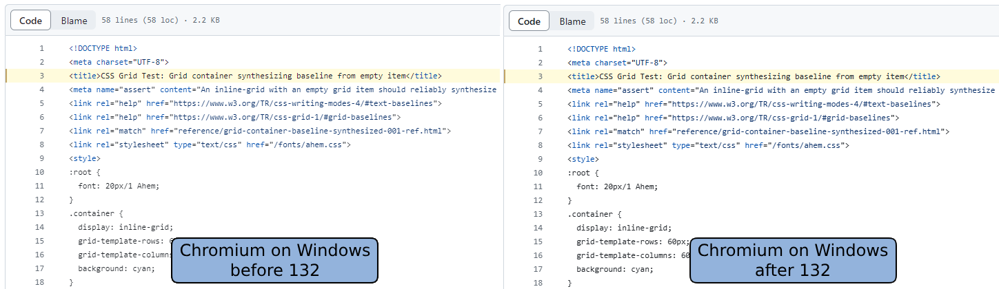
To me the one on the right looks slightly darker/bolder, but not qualitatively better. The stems on the letter "m" in "<meta" in lines 2 and 4 are badly hinted (smeared/mushy looking), and drawn differently even though they're in the same horizontal position in both lines.
Whoah, for me the left looks unreadably blurry... but it sounds like that's only me? If other people saw it I have a hard time believing they wouldn't mention such a significant difference and just talk about "I stems" instead.
It's a very subtle difference but noticeable in the anti-aliasing.
I don't have Windows right now, so I haven't tested if the change's closer to Firefox - but Firefox always had some heavy antialiasing on Windows, which I wasn't a fan of.