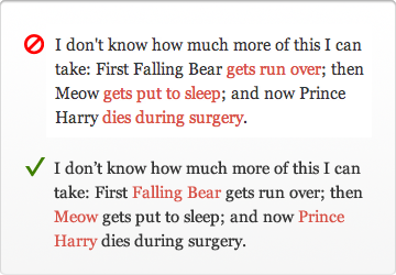
I think this example (http://uxmovement.com/wp-content/uploads/2012/06/clickhere_n...) is absolutely awful. Many websites style text in many ways, if you're going to refuse to have "click here" (or any other call to action) then you absolutely must stick to common patterns: links being blue and underlined.