Hacker News new | ask | show | jobs
by notpushkin 691 days ago
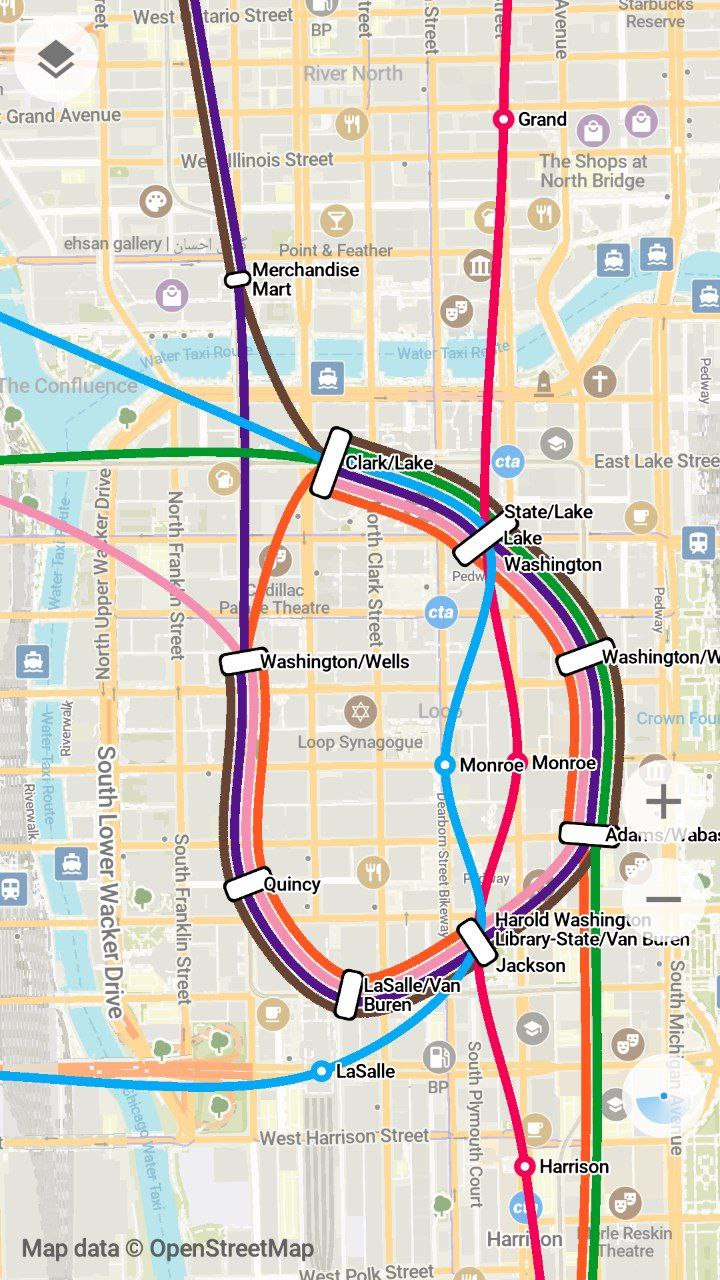
> Organic Maps have very beautiful transit lines representation in the style of Transit app's great work.

I've just opened up Chicago in Organic Maps and it isn't anything like Transit app: https://u.ale.sh/omaps-chicago-loop.jpg

It works great for simpler transit systems, but certainly there’s some room for improvement!

1 comments

Not sure about your harsh comparison. Organic's version is less of a rectangle, but is very lisible as well.
I mean yeah, it is quite good already! But sometimes lines break on stations (see e.g. the green and brown lines on Clark/Lake) and there are some unnecessary intersections (e.g. pink and purple on Washington/Wells – can be avoided by swapping them in in the line “bundle”).

Solving these problems would make the map not just prettier, but also easier to read and understand. Of course, doing this by hand isn't really feasible on Organic’s / OSM’s scale, but the blog post you linked is pretty much a how-to guide that can be implemented in code. I’d love to work on something like that, but don’t really know where to start.