|
|
|
|
|
|
by jjcm
705 days ago
|
|
|
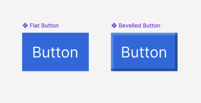
One of the mistakes I made as a young designer was pushing back against trends and fads. My opinion at the time was that trends that weren't thought out from a position of UX principles were an anti-pattern to follow. As I matured more as a designer, I now think nearly the opposite - not following trends is an anti-pattern, since that's what your users will be used to. Pull down to refresh is a great example of this. Not visible or discoverable at all, but was all the hype when Tweetie first released it. On paper it's an anti-pattern, but now it's so ingrained as a trend and pattern that it became expected, and is now muscle memory for many users. The same goes with flat buttons - I used to be quite opposed to them since there was no visual elevation off the page designating it as a button. Now if you create a button with a bevel, users will think it's an ad, not part of the page itself. Copying leads to harmony in the wider ecosystem, and it creates a defined agreement on what things are are how they work. It's an important part of the user experience. |
|
|
Pull to refresh is useful and optional.
Flat buttons save precious space on tiny mobile devices.