Y
Hacker News
new
|
ask
|
show
|
jobs
by
medstrom
721 days ago
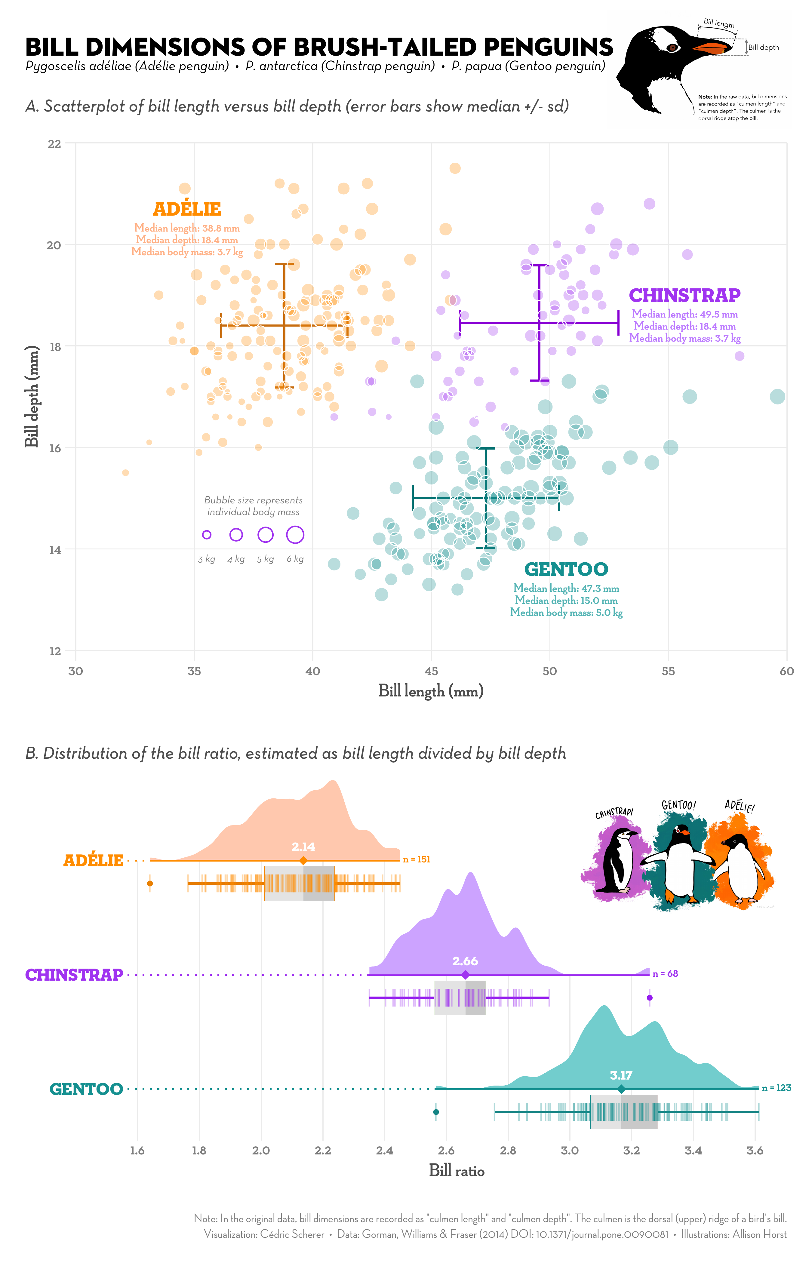
Perhaps you'd find the half-violin plot more readable? Seems there's a whole world of all-in-one "raincloud plots" that integrates them, like the lower infographic here:
https://raw.githubusercontent.com/Z3tt/TidyTuesday/main/plot...
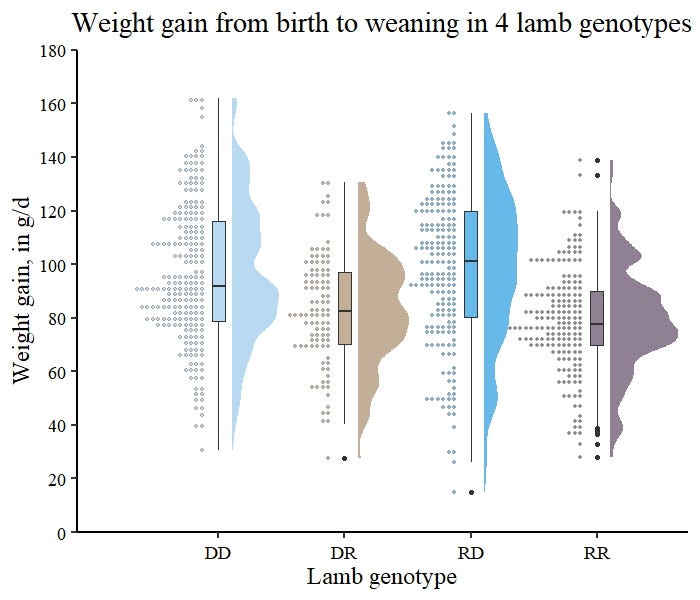
You can even make 'em show histograms:
https://miro.medium.com/v2/1*J3Q4JKXa9WwJHtNaXRu-kQ.jpeg
1 comments
catlifeonmars
720 days ago
For the latter, it looks like the histogram is probably sufficient. The violin plot just adds extra visual noise.
link