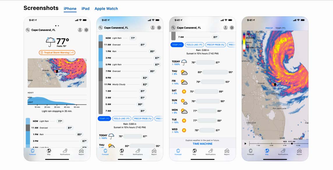
| Very cool! I'll definitely keep an eye on it. Looking at it right now, here would be my initial feedback and some ideas: - Depending on where you're located, I'm not sure if you've noticed that when there is a space in the city name it throws a %20 in there instead of space. Probably need a url decode on there... interestingly, this issues goes away when I just the locate button within the map and location services are triggered. - It seems to find my location without actually prompting, are you using an IP lookup or something instead of location services? It seems to work, but having the ability to also specify a location where I'm not at would be good (I'm sure this is planned). As mentioned above, the location services are called when using the map locate button, so I imagine the bug in the first bullet is related to the 2 different methods of gathering location. - I'm not sure if showing the a date or two in the past is for your testing or on purpose, but I kind of like it. People seem to ask me all the time if it rained yesterday, so having an easy reference for things like that is nice. For something really extra... something that shows what the forecast was vs what actually happened would be really interesting for getting a sense of how accurate the forecasts were. Presenting something like that well, so it's easy and obvious would be a big UI challenge. I know a lot of people complain about weather apps having bad data and are always looking for a better one. Having actual data every time the site/app is opened that shows how far off it was would go a long way to prove those criticisms right or wrong. My trust in a weather report would go way up if I regularly saw those deltas were small. - A way to visually see temperature and precipitation for the full 7 day forecast is always the main thing I'm looking for. High and low temp, graphed, for the week (this is the one thing Apple did take from Dark Sky that I still like). Inter-day temps for each day in a similar format to the week. And the precipitation like you have it (or as an area chart). I did really like the Dark Sky way of having a vertical bar for the precipitation, with the temps plotted next to it. I think that made it easier to see the separation between the days, while having everything horizontal makes it all blend together a little more. - I'm not totally sure what's going on with the 3 precipitation forecast bars. It looks like 2 of them have a current time marker. I'm going to assume this is you playing with different ways to show it, 24hr vs 48hr? My initial gut thought for the current weather view is a 24 hour bar with 4 hours in the past and 20 hours into the future (for temp and precipitation). Then the 7 day forecast can show 24 hours at a time for each day, which could be expanded or collapsed. - A way to change between imperial and metric measures would be good. Right now I'm seeing the temp in Fahrenheit, while the distance and precipitation is in metric, so it's a bit of a mix out of the box. - Sunrise / Sunset timing is something I find useful, though I have it on my phone's lock screen at this point. - Something I've recently discovered in Apple's weather app is the Averages tile. I've started using this a lot any time I'm looking at traveling somewhere, so I can get an idea of when to go or how to pack. This isn't a critical MVP feature at all, so I wouldn't prioritize it. But if you end up taking this really far, that is something I find pretty useful and cool. - Just spitballing... I wonder if the 7 day forecast bars would be good all lined up horizontally with a horizontal scroll to look into the future, so it's more like looking through a calendar week. I think this might make it easier for someone to more easily see it will ran in 3 days, rather than having to know today is Friday and it says it will rain on Tuesday, which is 4 days away. This would be another UI challenge to do well without it being a cramped mess. It would probably need to default to a collapsed view, then clicking on a day would expand that day's bar to show more details. - I assume all the json data is for your own testing |
- I have sometimes noticed the `%20` issue; it should be simple to fix. (The location name can come from multiple sources.)
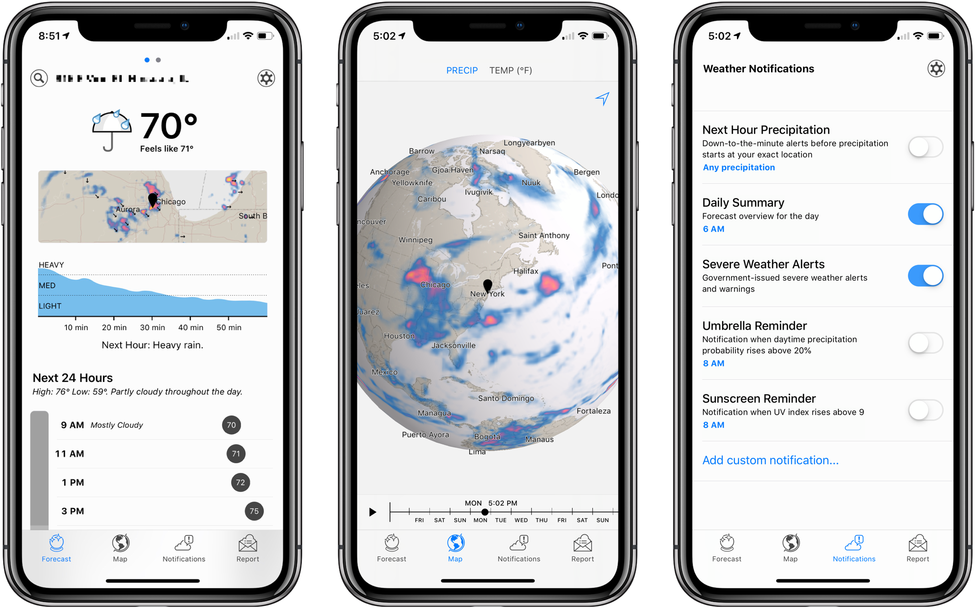
- The app first tries to estimate your location based on your IP address. There is less friction (no additional prompts/permission required) but it can be very inaccurate. Eventually, you will be able to specify most settings/input via UI and/or URL params. For example, you will be able to enter all or none of: lat/lng, location name, C/F, etc. When a value isn't provided, a logical default will be used (like lat/lng from location name, or location name from lat/lng).
- Showing previous dates is very intentional (https://blog.leftium.com/2013/12/how-to-display-temperature-...). Weather stats are very relative, so "trendcasts" combine past history with future forecasts. (Also see the previous version: https://uw.leftium.com/)
- "I did really like the Dark Sky way of having a vertical bar for the precipitation, with the temps plotted next to it." I'm not sure exactly how that looked. Can you share any screenshots?
- The daily precipitation forecast bars will have an option to toggle showing the previous history. I was playing around with how they would look. The "current time" marker will track the cursor/finger on hover so you can see exact numbers in the sticky top section (Merry Sky sort of has this, but it's not sticky and hover only works in a few places.)
- You can already click any temperature stats to toggle between Fahrenheit and Celsius. I default to F because I still believe it is the more "human" metric for weather temperature. I use mm for precipitation because I feel that is the more useful unit for precipitation, but in the future this will also be configurable/togglable.
- Sunrise/sunset is one of the features I plan to steal from Merry Sky. The data is available in the JSON, but Merry-Timeline doesn't support rendering like Merry Sky (https://github.com/guillaume/merry-timeline/issues/4). I will probably end up writing my own forecast timeline component.
- Merry Sky already kind of has forecast bars lined up horizontally; I think shading the days with alternating colors would make it more readable. Openweather also has this (although it also needs to shade to make the days more distinguishable, too.) I'm not a big fan of horizontal scrolling, but I may add it as an option.