|
|
|
|
|
|
by vel0city
852 days ago
|
|
|
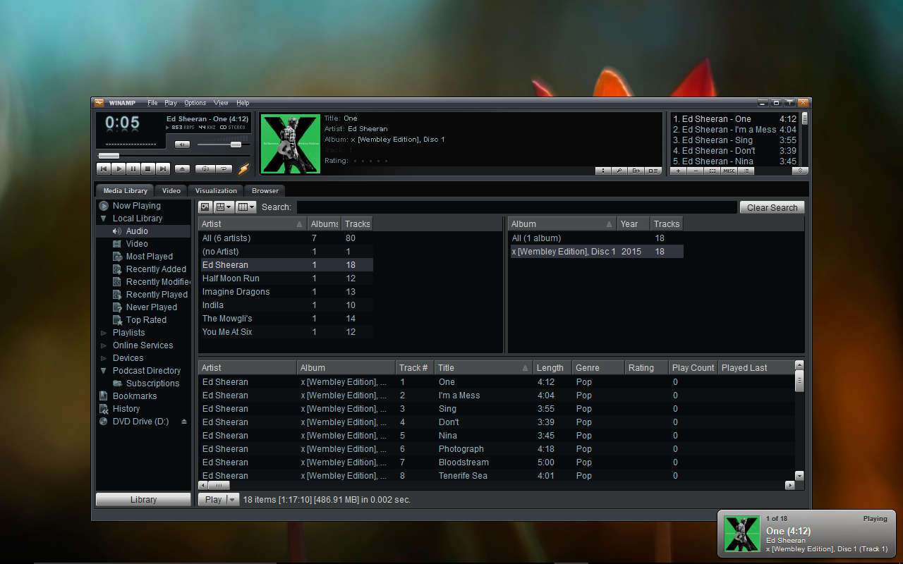
Default library view has a search box at the top and three main panes. Two on top, one on bottom. Top left is a list of all the artists in your library. Top right is a list of all the albums. Bottom is a list of all tracks that match the existing filters. Click on an artist, and it filters the albums and tracks, Click on an album, and it filters the tracks. Very information dense, extremely fast search, very responsive UI. https://cdn.mos.cms.futurecdn.net/RZcn2kEEAjWWV2jXYuJNUc.png Compared to Spotify, where when I open it it defaults to a list of six playlists, a bunch of big fat tiles of podcasts I've never once listened to, a "Made for vel0city" horizontal scroll of auto-playlists, on and on. Extremely low density view, which is fine for a mobile device prioritizing touch but I'd like a denser view for desktop usage. |
|
|