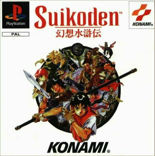
Suikoden was released on PS1 in 1995, so he would have been just 26 at that time. Amazing. When the topic comes up of changing Japanese box art for western audiences, the first game I think of is Suikoden.
The sprite-based games of old certainly gave wide latitude for how you choose to interpret the character designs. It doesn't surprise me that at that time they would've chosen to supplement the sprites with western-style art designs for a western audience.
It's in the same vein (but not quite as hilarious IMO) as what they did to Breath of Fire II's art.
It's a miracle that the NA cover art for Ico came out so beautifully (EDIT: somehow I confused the beautiful Japan/European box art with the NA box art. The NA box art is horrible)
I love this US box art so much it's so dreadful and left such a weird impression on me initially. My friends and I had a hell of a time trying to figure out who the characters were meant to be.
I think by the end of it, our conclusions were:
Left Side: Barbarossa, Ted, Windy
Right Side: McDohl (maybe Luc?), Leknaat, Three headed skeleton demon because ???
Flying on the dragon I always assumed to be Futch, but who knows. If it's Luc in the corner, I guess it could be McDohl in the center, (he is the main character after all.)
I love how the US box art feels like some obscure Nobunaga's Ambition / Romance of Three Kingdoms strategy game. I can understand why marketing probably thought it was! It's just hilarious.
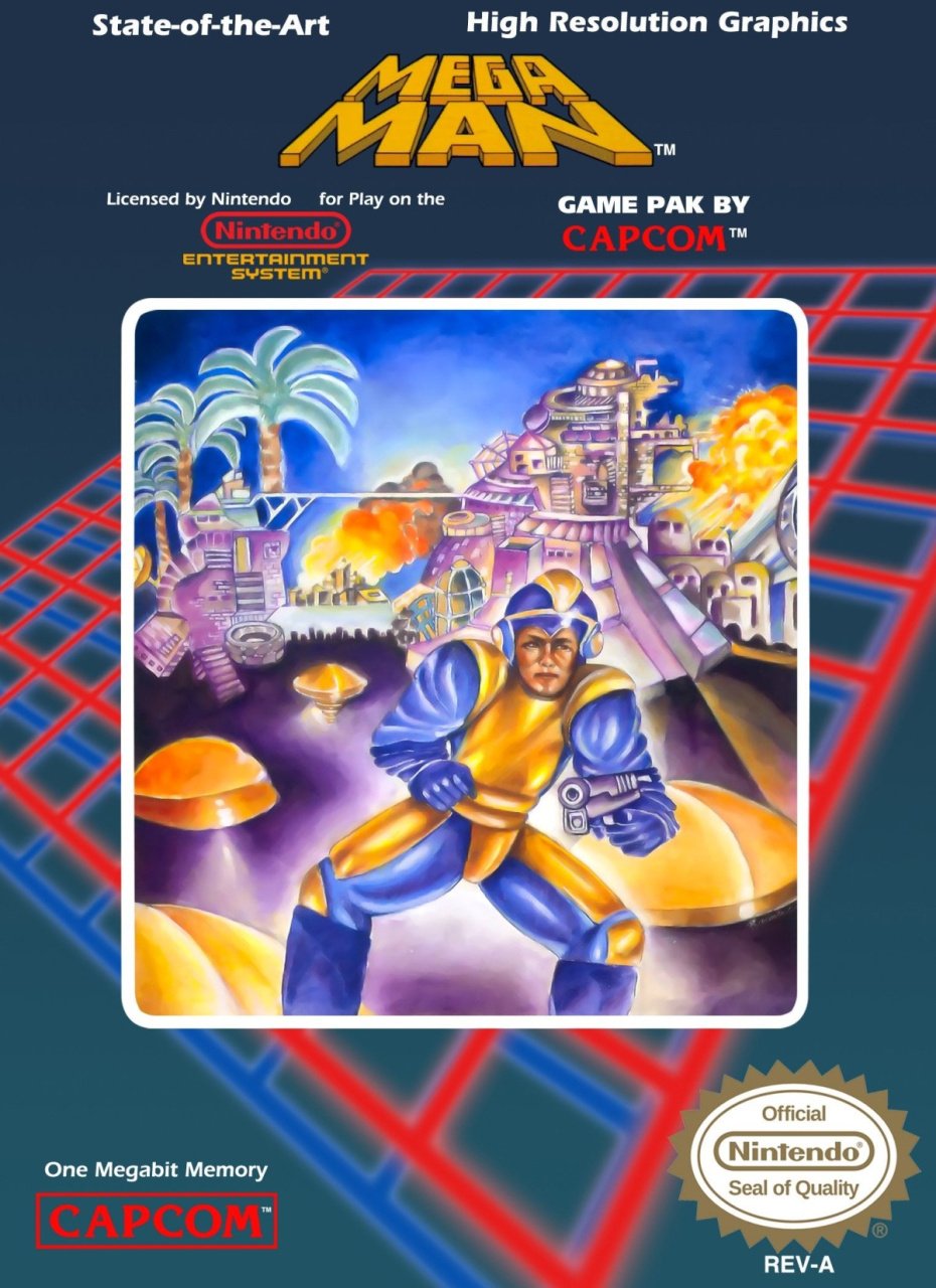
At least, compared to Mega Man, the Suikoden art is like... competently executed? It's no masterpiece, and has essentially zero correlation to the game, but it's at least professional!
For those not aware of Mega Man's box art, though... gaze upon this wonder
It's in the same vein (but not quite as hilarious IMO) as what they did to Breath of Fire II's art.
JP: https://gamefaqs.gamespot.com/a/box/3/8/2/16382_front.jpg
ENG: https://gamefaqs.gamespot.com/a/box/3/8/3/16383_front.jpg
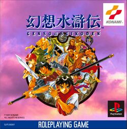
From blue-haired anime teenager to Frank Frazetta-style barbarian!