|
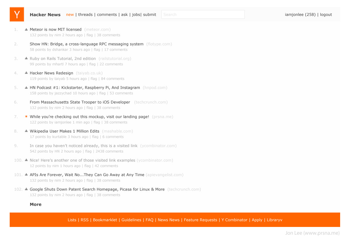
I'm sorry, but this is a perfect example of the difference between design and eye candy. Often, people wonder why I spend $50,000 a year going to design school, when I can learn how to make things that are just as shiny by reading psdtuts.com. The difference is that style is only skin-deep. It's superficial. It's an added bonus on top of design. Design, on the other hand, is the core of the product: how it functions. It's the soul: what story it tells. Your redesign, while prettier, does nothing to improve the user experience, or to tell a story. Sure, it's easier on the eyes, but it's a much worse design, in that it makes the user experience worse. It's now harder to read: less information is on the screen. (11 story as opposed to 25, on my screen.) The information hierarchy within stories is less clear. The eye has to jump around more to get the secondary information (poster / point count / comment count / time posted). The flag functionality is simply gone… You did a good job making it look better, and should be commended for that. But as for the design, try again. PS: Take this as friendly critique. Take it in, learn what you can, try again. Rise, repeat. Don't be discouraged, but realize you have a long way to go. You'll get there! -- Note: Check out this redesign, which I think is quite effective, and is installable as a extra stylesheet on the current HN code: http://akhun.com/seo/skitch/Hacker_News-20120420-180413.png |
This is why I disagree with the notion that style is only skin-deep. It's an integral part of UX, but only when considered within the framework of UX. The points value is now shaded in 3D: Why? The rank is now an orange circle: How does this help the user?
The best visual design is always based on UX. Do users consult the rank often? If not, the orange should be reserved for something else more demanding of the user's attention. Are the point totals interactive? If not, the 3D shading should be saved for use as an affordance somewhere where there is interaction. It's questions like these that turn a pretty visual design into something that not only looks but works great.